ACM Commentary 3Q 2016
MARKET SUMMARY
The S&P 500 achieved a 3.9% return in the quarter, with virtually all the gains coming in the month of July, as both August and September were basically flat. On the whole, the S&P has provided investors a 7.8% return on the year.
At Alamar, our equity strategy was up 2.6% on the quarter and 2.4% on the year, both returns lagging the overall market. As with many active managers, we have had a tough time keeping up with the broader markets in recent months. However, we maintain our advantage since our inception on January 1st, 2010 with a 13.4% annualized net of fees return against a 12.7% return for the S&P.
The Chart below reflects a change of course for the market in the quarter towards growth oriented sectors such as technology, while high dividend paying sectors like staples, telecom, and materials gave back some gains.

In fact, this trend has continued so far into the 4th quarter with defensive sectors leading the market lower, as opposed to providing investors a respite from the uncertainty leading up to the November 8th elections, and continuing to lag since Trump’s recent victory. High dividend and low volatility funds are stuffed with defensive shares, which provide high income, but very little subsequent growth. In many respects, low volatility stocks that look and act like bonds, have been the momentum stocks of the recovery, and outperformed in recent years. This outperformance has generated further interest and more capital, driving valuations higher. With a highly anticipated rate hike in December, and a perceived subtle reversal to the Fed’s unprecedented accommodative monetary policy, it is logical to conclude that high income and defensively exposed investors are reading the writing on the wall and starting to push the sell button. As active investors, Alamar would view a market that trades on fundamentals as opposed to Fed policy favorably. This shift may be an early signal that strides are being made in that direction. Given the tremendous flow of assets into passive investments, and other niche ETF funds, we have been wondering lately what the ramifications would be if we find ourselves in an environment where investors start pushing more sell buttons.
PASSIVE INVESTING
Passive, or index, investing is the construction of a portfolio with the intent to mirror the components of a market index. For example the well-known Vanguard 500 Index fund is invested in the 500 stocks of the Standard and Poor’s 500 Index on a market capitalization basis. This means that larger stocks by capitalization carry higher weightings in the index. Proponents of index investing eschew active investment management because they believe that it is impossible to “beat the market” once trading costs and taxes are taken into account. Additionally, index funds usually have lower management fees and expenses than actively managed funds. The concept has been around for many years, and with considerable success.
Chart 2 below reflects the historical growth in assets at Vanguard, a well-regarded passive oriented mutual fund company.

Vanguard has seen tremendous growth since its inception in 1975, as have many of its peers. Remarkably, however, much of this growth has occurred in the last decade, confirming an acceleration of the trend during a period when active management has particularly struggled. For instance, since the 2008 Financial Crisis, fund flows to active strategies have been flat to negative in every year, except one (Chart 3)! On the other hand, passive strategies have seen considerable in flows every year, and now represent over 34% of the overall funds market, up from less than 20% in 2009.

Of course, the decision by investors to index results in all participants in an owning the same stocks and at the same weightings. For instance, everyone that owns the S&P 500 index holds a 3% position in Apple (APPL). While investors who have purchased the NASDAQ index (QQQ) have taken an even bigger bite and hold a 10% position in the stock. We suspect that many index fund investors do not realize the concentrated bets that they may be making in just a few stocks. This concentration results in a lot of support for a stock like Apple when fund flows to these indexes are positive. However, as we have written about in the past, this over-crowding eventually leads to tears. Why? Because when everyone owns the same stock there is no one left to buy when the crowd starts to flee.
There has been much discussion in the media in recent months about passive investing and its incredible growth. Getting less attention, though, has been the response by many active managers to the challenge presented by index funds.
CLOSET INDEXING
One would think that active managers would respond to their loss of market share by striving to differentiate themselves from the benchmarks, but this has not been the case. For many firms the temptation to own a stock like Apple in their funds often overcomes them. This is because of its large representative weighting in the index, and due to the fear that holding names outside their index might lead to considerable short term underperformance and a loss of assets. As a result, these funds elect to mimic, or closet index, by owning many of the same positions as their benchmark.
Ironically, by choosing to closet index these funds, and the firms who run them, are essentially insuring their own demise over time. This is because they are virtually guaranteed to lag their respective benchmark when including transaction costs and fees. To us this is foolish really. In essence it is the same thing as an investor paying a wealth advisor a 1% over sight fee to purchase the S&P 500 index on their behalf. It also works to increase the overcrowding, or concentration risk discussed above. Professors Martijn Cremers of the University of Notre Dame and Antti Petajisto, formerly of New York and Yale Universities have written extensively on this subject. Chart 4 provided from one of their recent papers, displays the percentage of active managers who have managed at least 80% of their assets in an active manner since 1980. Active management, or active share, can be defined as the fraction of the portfolio that is different from the benchmark index. The 80% threshold is viewed as the litmus test for true active management, while levels below 60% reflect the cut off as a closet indexer.

As you can see, the chart shows a fairly consistent and stable retreat from active management starting in the early 80’s, and increasing in the later part of the 90’s. Similar to the environment today, the late 90’s was a period of time in which the market was being driven by just a few stocks, admittedly at much higher valuations. Though the trend is consistent, the graph does show an uptick towards active management coming out of the dotcom crisis, a period of time that favored the active approach.
In our experience, many investment management firms start with high active share and then tend to drift towards the index slowly over time. Take the case of the of the Fidelity Magellan fund (FMAGX), an active strategy run by famed investor Peter Lynch throughout the 80’s. Under Mr. Lynch’s leadership the Magellan fund posted a 29% annual return from 1977 to 1990. Chart 5 measures the strategy’s historical year end active share. Considerable research has been done to indicate that high active share managers, by virtue of their willingness to swim against the tide, have the highest likelihood of out-performing. Therefore, the statistic is viewed as a good predictor, but not guarantee, of future fund performance over time.

For many years Fidelity Magellan was known as an aggressive and highly successful fund. However, its active management approach witnessed a steady decline, and then a significant change under the management of Robert Stanksy (’96-’04), when it became a closet indexer. The performance of the fund over his tenure is shown below, and tells an all too familiar story of performance chasing:

Stansky was given a fund with $50.0 billion in assets in 1996 and, as you can see, under performed significantly in his first two years at the helm. Then, under pressure to keep up with the market from fund investors and likely to retain assets from Fidelity management, he effectively became the market. In total, Stansky lagged his benchmark by 2% per year over the 9 year period (7.5% vs 9.4%). He retired in 2004, handing Magellan to a replacement who pledged to return the fund to its more active “go anywhere” roots.
Compare the chart above with Chart 6 below, which depicts the historical active share of Alamar’s Equity strategy. The chart shows that we are firmly entrenched in the active camp. We remain committed to staying there, despite short term performance swings. In fact, active share is often most frequently conducted by smaller niche money managers like Alamar, who have not yet attracted considerable assets and the associated overhead costs. Again, high active share is no guarantee that a fund will outperform, but it is likely a necessary condition.

CONCLUDING THOUGHTS
It is clear that passive investing is not going anywhere anytime soon, and it is difficult to determine how much market share it will continue to take from the active camp. In large part this will be determined by active management’s ability to justify its higher fees and transaction cost through relative outperformance. At Alamar we have been able to outperform the market since inception by engaging in a high active share approach.
Index investors may experience difficulty in a market correction due to heavy selling pressure. These challenges could be exacerbated due to the unprecedented flow of assets into passive strategies and the increasing temptation for many to closet index. As a result, we believe that a highly active component might be a nice complement to an existing index strategy. In fact, we currently offer this approach to several of our wealth management clients, where we are playing a larger role in the management of their finances.
Investors buying active management need to make sure that they are securing the benefits that they are paying for, and not simply doubling down on existing passive bets. There are many funds, and wealth advisors for that matter, still charging high fees for very little active management, and giving investors the market in return.
Thank you for your continued interest and consideration of Alamar –
Sincerely,
John Murphy, CFA
Disclosures
The views expressed in this note are as of the date initially published and are subject to change without notice. Alamar has no obligation or duty to update the information contained in this note. Past performance is not an indication of future results. Risk is inherent in investments and involves the possibility of loss. Net of fee performance is calculated using the highest fee. The Russell 3000 Index measures the performance of the largest 3000 U.S. companies representing approximately 98% of the investable U.S. equity market. The S&P 500 Index, which is a market-capitalization weighted index containing the 500 most widely held companies chosen with respect to market size, liquidity, and industry.
This publication is made available for informational purposes only and should not be used for any other purpose. In particular, this report should not be construed as a solicitation of an offer to buy or sell any security. Information contained herein was obtained and derived from independent third-party sources. Alamar Capital Management, LLC believes the sources are reliable; however, it cannot guarantee the accuracy of such information and has not independently verified the accuracy or completeness of such information.
This publication, and the information contained herein, may not be copied, reproduced, republished, or posted in whole or in part, in any form or media without the prior written consent of Alamar Capital.
ACM Commentary 2Q 2016
A lot has happened since our last update, however, the US equity market is stuck in the doldrums, as we expected. Given the upcoming election season, we will cover some of the fundamental economic issues facing the next President and our views on the latest external shock – Brexit.
We continue to search for good ideas in this volatile market environment. Companies that show decent growth are overpriced while much of the rest exhibit no growth. Investors have flocked to companies with dividends seeking income since they cannot obtain it from purchasing Treasuries. For instance, market segments that pay high dividends such as the Utility and Telecom sectors are up 23.4% and 25% respectively through June this year.
BREXIT
While we do not have any direct investments in the United Kingdom (UK), we do have investments that generate revenues in Europe and Britain in particular. The impact of Brexit (the departure of the UK from the EU) is therefore of importance to us. Before we get to the impact, it is worthwhile to focus on the reasons why voters, particularly outside London & Scotland, chose to leave the European Union (EU). Voter turnout was an astonishing 72%! Clearly the populace wanted their voices heard. Despite the aggressive lobbying to remain in the EU by both the major political parties, business executives, and the pessimistic consequences of Brexit forecast by economists & financial analysts, Britons chose to leave the EU. What particularly struck us, besides the surprising outcome, was the large difference in voting behavior between the voters of London & Scotland and the rest of the country. Figure 1 depicts the voting results by region.

As seen from the figure, 55% to 60% of the voters outside London, Scotland and Northern Ireland voted to leave. The contrasting appreciation of the EU is illustrative of the gulf between the people who benefited from globalization and those left behind. The results serve as a potential harbinger of the upcoming elections in the United States. A large segment of the US population is also unnerved by the outcome of trade liberalization and its consequences. Both Donald Trump and Bernie Sanders have effectively tapped this zeitgeist. In our view, Brexit, Trump and Bernie are all expressions of the same underlying malady. We will explore its implications for the US in the next section.
Now that Brexit is in motion, we ponder its economic consequences. Whilst the long-term outcome is unpredictable, the short-term impact has already occurred. The UK pound has fallen 11% against the US Dollar and the Euro since the vote and is down 17% over the last 12 months against both currencies. In effect, all UK goods, services and assets are 11% cheaper than before. The UK starts with an inherent 11% advantage even if the EU were to impose some tariffs on UK sourced products as punishment for Brexit. Brexit has accomplished what reduced interest rates and quantitative easing by the Bank of England failed to do: devalue the UK currency and restore competitiveness.
DOMESTIC IMPLICATIONS
As mentioned earlier, we believe the rise of Donald Trump and Bernie Sanders has similar antecedents to Brexit. Globalization has benefited some but has hurt many Americans. While this phenomenon may be invisible to the denizens of the major metropolises such as New York, Los Angeles or Silicon Valley, the impact is apparent elsewhere. Figure 2 plots the concentration of wealth over the last 100 years in the US. Wealth has concentrated in fewer hands more or less unabated since 1978. It is now approaching levels last seen before the onset of the Great Depression. The financial crises in 2008 did not stop or even slowdown the trajectory.

The top 10% now control 80% of the nation’s wealth. As the middle class and those below lose ground they are looking for suspects and their focus has now shifted to global trade & immigration. They believe globalization and trade liberalization may have resulted in wealth concentrating in the hands of the elite (top 1%). As Figure 3 depicts, increasing inequality is associated with rising societal anxiety and social problems.

Both Bernie Sanders and Donald Trump have captured the angst of the population and proclaimed global trade as the cause of the problems. Both would like to unwind NAFTA (free trade amongst Canada, US & Mexico) and revise World Trade Organization (WTO) regulations. Hillary Clinton has belatedly embraced Bernie’s beliefs on global trade. Ironically, or perhaps coincidentally, world trade has already begun to slow down. Figure 4 depicts world trade volumes since 2005. Since the first quarter of 2015 trade volumes have flattened and actually declined in dollar value.

From our view it is unclear if global trade is the cause of wealth concentration, after all, global trade was much lower back in 1928 and we faced similar levels of wealth distribution. However, we do expect trade to be impacted no matter who is elected President in November.
CONCLUDING THOUGHTS
Brexit and the upcoming US elections are part of the same continuum. Both events are symptomatic of the general anxiety of the current economic climate. Lack of income due to extremely low interest rates has forced investors into high dividend stocks. Investors are looking at dividend paying stocks as bond substitutes. High & stable dividends are typically found in the Utilities, Consumer Staples, Telecommunications and Real Estate sectors. As a result these sectors have led the rebound to new market highs this year. Investor demand has pushed valuations to unreasonable levels in some instances.
Growth is anemic and valuations are not cheap. As a result we remain cautious in deploying capital in the current circumstances and continue to look for opportunities that meet our investment criteria.
Thank you for your continued trust and confidence in Alamar Capital Management.
Sincerely,
George Tharakan, CFA
george@alamarcapital.com
Disclosures
The views expressed in this note are as of the date initially published and are subject to change without notice. Alamar has no obligation or duty to update the information contained in this note. Past performance is not an indication of future results. Risk is inherent in investments and involves the possibility of loss.
This publication is made available for informational purposes only and should not be used for any other purpose. In particular, this report should not be construed as a solicitation of an offer to buy or sell any security. Information contained herein was obtained and derived from independent third-party sources. Alamar Capital Management, LLC believes the sources are reliable; however, it cannot guarantee the accuracy of such information and has not independently verified the accuracy or completeness of such information.
This publication, and the information contained herein, may not be copied, reproduced, republished, or posted in whole or in part, in any form or media without the prior written consent of Alamar Capital.
ACM Commentary 4Q 2015
As we expected, equity markets did poorly in 2015. The S&P 500 was down on a price basis and was up a bit over 1% when including dividends. Our equity accounts performed a touch better, up over 2% for the year, net of fees. Since inception in 2010 our accounts are up 14.7% annualized while the S&P500 is up 13%. More interesting is how we achieved these returns. Since inception we have maintained an average cash position of 10% to capitalize on opportunities as they present themselves. We began and ended last year with over 15% cash levels. Due to our aversion to invest in “popular” stocks touted incessantly on business TV channels, we typically have a lower exposure to market gyrations. Our exposure or risk to the market can be measured by a metric known as market Beta. A Beta of 1.0 implies full exposure to the overall market. Beta of 0.8 indicates an 80% exposure while Beta of 1.2 implies exposure of 120%. Since inception our Beta has ranged from 0.8 to 0.86 depending on the market benchmark. Alpha, the holy grail of investing, is the outperformance over the market adjusting for the risk (or Beta) taken. Our alpha since inception has averaged roughly 5% per year.
We concluded our client note a year ago by stating that “Market valuations are beginning to look frothy to us” (all our past writings are available on our website). We reiterate the same sentiment once again and in fact we think it’s worse now because investors have piled into a few well-known stocks seeking growth. We will explore this issue and corporate behavior, specifically mergers & acquisitions (M&A), in this note. Our observations on the US economy
will also be covered.
ALL ABOARD THE FAMA TRAIN
The market last year was characterized by fear and greed. Fear of the overall market and greed in the success of a few companies. In this note we will call these chosen few: FAMA. FAMA stands for Facebook, Amazon, Microsoft and Alphabet (formerly Google). FAMA were the four horsemen that powered overall market returns last year. FAMA represents roughly 7.5% of the S&P500. Without FAMA the S&P500 was down 2% in 2015. Both the Mid-Cap and the Small-Cap markets were down 2% last year. The fact investors rushed into these 4 companies to carry a market of over 3,000 stocks in the US domestic market is amazing and also very troubling. Such over-crowding into a few fashionable names by individual, institutional and hedge-fund investors inevitably leads to tears. There is no one left to buy when the crowd starts to flee.
We have not invested in any of these 4 stocks since we began, not because these aren’t good companies, indeed they are, but because they are too fashionable amongst investors of all stripes. Many investors, especially those who invest in passive ETFs that represent the whole market, do not realize that they are part of this crowd. An investment in an S&P500 ETF for instance implies 7.5% of your portfolio is now exposed to FAMA. Our hunting ground has typically been in the small and mid-cap space where we find interesting, albeit unfashionable, well-managed companies generating profitable growth at reasonable valuations.
CORPORATE LOVE-FEST
Lack of investment opportunities is inducing corporate CEO’s into a veritable merger mania. Wall Street investment bankers and lawyers are greasing the wheels promoting all kinds of nonsensical deals. Last year was a record year in signings of corporate mergers & acquisitions (M&A). Global M&A hit an all-time high with $4.8 Trillion of deals announced in 2015, 16% more than the previous peak in 2007. The US led with almost $2 Trillion in announced mergers, up 40.6% compared to 2014.
Pfizer’s deal to buy Allergan for $200 Billion was the largest acquisition announced last year. It is also the largest transaction that Pfizer has ever done and the largest deal in the history of the pharmaceutical industry. Pfizer is no stranger to making large acquisitions and, in fact, the company has built its existing drug pipeline largely through acquisitions. Therefore, it is informative to look at Pfizer’s acquisition history to determine if any value has been created for its shareholders through all this deal-making.
We begin the analysis from the year 2000 when Pfizer began its large acquisition strategy with the purchase of Warner Lambert for over $112 Billion. Since then the company has completed another $154 Billion of purchases with notable ones including the acquisition of Pharmacia for $57 Billion in 2003 and Wyeth for $66 Billion in 2009. The company has also disposed of businesses such as its infant nutrition business to Nestle in 2012 for roughly $12 Billion and spun-off Zoetis to shareholders in 2013. The entire company was valued at $200 Billion at the end of last year. At the end of 1999 the company was valued at $75 Billion. With all these numbers the math is pretty straightforward to evaluate whether the management team of Pfizer has been effective in pursuing growth through acquisitions. Start with a company worth $75 Billion, add $266 Billion through deal making, subtract $53 Billion for selling stuff and shareholders should be left with $288 Billion ($75 + $266 – $53). However, the company is only worth $200 Billion now. Where did the missing $88 Billion of value go? Table 1 below depicts all these statistics.

Management teams are fond of making grand pronouncements when they announce large deals. There is talk of synergies on both the revenue and expense side and how shareholders will benefit from long-term value creation. The enablers, investment bankers from Wall Street and consultants, who propose these deals produce wonderful PowerPoint slides of the magic being created and earn their large fees upfront despite the inevitable destruction of shareholder wealth. We have no doubt bankers were very busy last year proposing many deals that looked very good on a slide presentation. We also have no doubt most of these deals, especially the large ones, will end in shareholder value destruction once the dust settles. In the Pfizer/Allergan transaction much talk was made in the press about the so-called tax synergies Pfizer would generate by relocating to low-tax Ireland. Perusing the foot-notes of Pfizer’s annual report shows the company’s tax rate is already fairly low. For example, last year the company paid $2.1 Billion in actual taxes on $12.2 Billion in pre-tax income for a 17% tax rate. It is doubtful the company can lower these rates much further even after moving its corporate domicile to Ireland.
US ECONOMY
The economic malaise that began in the oil patch at the end of 2014 has begun to percolate into other sectors of the economy. Weak oil prices has extended to other commodities such as copper, iron ore, corn, soybeans, wheat, cotton, pork and chicken. Deflation in the commodity sector is now widespread. Even Gold and Silver were not spared, both declined over 10% last year. The strengthening dollar particularly against the Canadian dollar and the Mexican Peso has weakened exporters, particularly in the manufacturing sector. We suspect the domestic manufacturing sector is now in a recession.
The primary culprit for the weakness here and abroad is China. The Chinese, in order to ameliorate the effects of the Great Recession of 2008/2009, went on a massive, debt-fueled investment spree. It is now time to pay the piper and experience the consequences of this malinvestment. The excess capacity built up in many sectors of the Chinese economy will inevitably lead to deflation in Chinese production. The negative effects emanating from China are filtering to other economies particularly those with close trading links such as Australia, Brazil & Malaysia. We discussed much of the issues we see in China in our Q3 2015 writing.
The most important question, in our mind, is whether the weakness in the domestic energy & industrial sectors will spill over to the overall US economy. So far, we have not observed a material weakness in the consumption patterns of the US consumer. Despite the turmoil around much of the world and the weakness in certain sectors of the domestic economy, the US consumer continues to spend, albeit at a modest rate. Will the weakness in the equity markets affect consumer spending through the wealth effect? This is something we will be watching closely in the coming months. Since the bottom of the recession in late 2009, hiring has picked up pace and is almost back to prior peaks. Figure 1 below charts the progress of hiring over the last decade. As seen from the figure, despite the substantial economic headwinds, hiring has continued at a steady pace since 2010 and if this continues the US consumer will probably keep spending. However, if hiring falters then all bets are off.
CONCLUDING THOUGHTS
After lowering rates and stimulating the economy for almost a decade the Federal Reserve has finally begun to raise rates. This tighter monetary environment, combined with weakness in countries’ economies such as China, Japan & Brazil and a downturn in the energy and industrial sectors is a cause for concern. Investors fled this uncertain environment and took shelter in a few, high-profile momentum stocks last year. We did not engage in this behavior because it looked like a crowded trade to us. It is difficult to leave when the sentiment turns and there is a mad dash to the exits.
Growth in profits is difficult to come by and corporate managements have resorted to acquisitions and financial engineering to show growth in earnings per share. Such gimmicks have a short life span and companies will eventually have to produce sustainable, organic growth. Similar to a year ago, we continue to be cautious deploying capital in this environment and are maintaining a healthy cash reserve. As in the past, we hope to deploy these reserves quickly once opportunities present themselves. Thank you for your continued trust and confidence in Alamar Capital Management.
Sincerely,
George Tharakan, CFA
george@alamarcapital.com
Disclosures
The views expressed in this note are as of the date initially published and are subject to change without notice. Alamar has no obligation or duty to update the information contained in this note. Past performance is not an indication of future results. Risk is inherent in investments and involves the possibility of loss.
This publication is made available for informational purposes only and should not be used for any other purpose. In particular, this report should not be construed as a solicitation of an offer to buy or sell any security. Information contained herein was obtained and derived from independent third-party sources. Alamar Capital Management, LLC believes the sources are reliable; however, it cannot guarantee the accuracy of such information and has not independently verified the accuracy or completeness of such information.
This publication, and the information contained herein, may not be copied, reproduced, republished, or posted in whole or in part, in any form or media without the prior written consent of Alamar Capital.
ACM Commentary 3Q 2015
MARKET SUMMARY
As we have discussed over the past couple of quarters, overall frothiness in the markets continued to reveal itself in the 3rd quarter, with the S&P 500 pulling back -6.4%. The combination of slowing domestic and global growth, a strong US currency, weak energy sector, and continued anticipation of a Fed Rate hike proved too much for the market to overcome, forcing it into negative territory. It is now down -5.3% on the year.
For our part, our Equity strategy was down -5.4% in 3Q and remains just positive at 0.4% net of fees for the year. Since our inception January 1st 2010, we have achieved a 15.1% annualized net of fees return compared to the S&P 500’s return of 12.2%.
FEAR BACK IN THE MARKET
Of notable interest to us in the quarter, was a significant jump in the CBOE Volatility Index (VIX). The VIX, often referred to as the fear gauge, had been quiet for some time leading many market pundits, Alamar included, to worry that investors, now 6 years into a bull market, had been lulled into a false sense of security. The chart below (Figure 1) plots the VIX index dating back to 2004. VIX values greater than 30 are generally associated with a large amount of volatility as a result of investor fear or uncertainty, while values below 20 generally correspond to less stressful, even complacent times in the market.

As the chart suggests, there have been 3 meaningful spikes in the VIX over Alamar’s history as a firm. The market’s subsequent reaction to these spikes over the same time period can be seen in Figure 2.

Looking back, it is almost easy to forget these bouts of volatility, given the markets steady move higher in the years since the Great Recession. However, there has been plenty to worry about, starting first with fears of a double-dip recession and the emergence of the Greek crisis, which saw the S&P pull back -11.4% in 2Q 2010. Next, a problematic Europe, US budget stalemate, and the Standard and Poor’s downgrade of US debt resulted in a -13.9% correction in the 3rd quarter of 2011. Following this, the S&P was able to achieve a positive return in 13 of the next 15 quarters, with just minor pull backs in the 2nd and 4th quarter of 2012, before finally hitting some turbulence this fall. We thought we would discuss one of the key culprits in this most recent VIX spike and correction with this commentary, the role of the Chinese economy.
CHINA
We recently had the opportunity to do a presentation for several of our clients and friends here in our hometown of Santa Barbara. During the presentation, we shared the historically incredible performance of the Chinese economy in recent decades, and also some of the near term challenges. For instance, Figure 3 below compares how the Chinese Economy in the 2000s has dwarfed that of Japan’s economic miracle in the late 80’s and early 90’s.

As a result of this considerable growth, China now commands the 2nd largest economy in the world and a population of 1.4 billion rapidly industrializing citizens hungry for the world’s products and services. As the largest of the emerging markets, the lift off of the Chinese economy has put wind into the sails of other developing economies such as Brazil, Russia, India, and South Korea to name a few. As a result, capital has drifted from the developed world, toward these higher growth economies, in search of greater returns.
For comparison sake, the chart below (Figure 4) shows the historical and forecasted growth rate of China vs. a developed economy the US, from 1980 through 2020. China’s conversion to a market based economy has seen it experience hyper growth for many years, but the very large Chinese ship is beginning to slow down and it remains debatable just how quickly. This factor along with a stronger US currency and a weak energy sector has acted as a triple whammy for other emerging economies as their economies cool and capital exits.
Fortunately, as the chart shows, the US economy has not historically been overly dependent on China to achieve growth, and the correlation between their growth rates appears quite low. If this trend continues it could prove to be quite helpful to investors and businesses with considerable US domestic exposure.

The impact of China’s slowing growth has been most readily visible in their and other emerging stock markets and also in the commodity markets, where China has had an almost insatiable appetite in recent years (Figure 5).

For example, remarkably with just 20% of the global population and representing 13% of global GDP, China demands 60% of the world’s concrete and 48% of its copper! A slowing Chinese economy has seen commodity prices decrease by almost 43% in the past year.
Of further concern to us, given China’s history and lack of transparency, is the possibility their economy is performing even worse than the projections being provided to us by their government. It is this realization and debate that has resulted in much consternation for investors in recent months.
Despite not having any investments in China, we keep track of many Chinese statistics in order to get an independent read on the performance of the Chinese economy; Figure 6 depicts two of them.

The first measures the number of autos sold in China going back to the crisis of 2008. The second measures the number of containers in twenty-foot equivalent units (TEUs) coming into Hong Kong on ships over the same time period. These statistics, we believe, are not subject to manipulation by the Chinese government. Both show an economy that is not just slowing, but rather in contraction.
CONCLUDING THOUGHTS
Though we have not experienced a meaningful sustained correction since our inception in January 2010, the market has provided plenty of fireworks. We are happy to report that our equity strategy has held up well during these turbulent times, most notably this year, achieving a slightly positive return YTD when many are in the red.
We speculate the situation in China is probably worse than advertised, but it need not necessarily result in a derailing of the US economy which continues to stumble along. We have tilted the portfolio away from the energy sector, and other commodities, and continue to focus on companies with considerable US domestic exposure and runways for future growth.
Thank you for your continued consideration of Alamar.
Sincerely,
John Murphy, CFA
Disclosures
The views expressed in this note are as of the date initially published and are subject to change without notice. Alamar has no obligation or duty to update the information contained in this note. Past performance is not an indication of future results. Risk is inherent in investments and involves the possibility of loss. Net of fee performance is calculated using the highest fee. The Russell 3000 Index measures the performance of the largest 3000 U.S. companies representing approximately 98% of the investable U.S. equity market. The S&P 500 Index, which is a market-capitalization weighted index containing the 500 most widely held companies chosen with respect to market size, liquidity, and industry.
This publication is made available for informational purposes only and should not be used for any other purpose. In particular, this report should not be construed as a solicitation of an offer to buy or sell any security. Information contained herein was obtained and derived from independent third-party sources. Alamar Capital Management, LLC believes the sources are reliable; however, it cannot guarantee the accuracy of such information and has not independently verified the accuracy or completeness of such information.
This publication, and the information contained herein, may not be copied, reproduced, republished, or posted in whole or in part, in any form or media without the prior written consent of Alamar Capital.
ACM Commentary 2Q 2015
In our fourth quarter 2014 letter we discussed how valuations had become frothy and we were having difficulty finding suitable investments. Six months into the year our forecast has been borne out, the S&P500 is up roughly 1% through the end of the second quarter. Despite holding a sizeable portion of cash, our accounts are up roughly 6%, net of fees. Since inception in 2010, Alamar Equity is up 17% annualized while the S&P500 is up 14.2% during the same period.
In addition to high valuations, this year has brought on two additional headwinds (exchange rates & commodity prices) which will restrain economic growth. We will discuss both these issues in this letter.
EXCHANGE RATES
The ongoing Greek crisis in Europe, problems in Russia, slowdown in China and upcoming rate increases indicated by the Federal Reserve have led to a rush of investments into the US Dollar. As a result the dollar has strengthened and, conversely, currencies across the board have weakened. Figure 1 plots the trade-weighted value of the US Dollar against a basket of currencies.

As of June the dollar is up 12.5% over the previous year against a broad basket of currencies. The dollar is not too far off its 40-year high reached in early 2002. This creates a tremendous headwind for US based exporters and, if sustained, could potentially lead to more jobs and factories moving offshore to take advantage of weaker currencies elsewhere. The weakness of the Canadian dollar and the Mexican Peso, in particular, bears scrutiny because of geographic proximity and widespread cross-border trade. Both these currencies are now hitting multidecade (Canadian) or historical (Mexican) lows against the US dollar.
COMMODITIES
The other headwind buffeting the economy worldwide is commodity prices. While some industries and countries benefit from low commodity prices (US, China, India to name a few), there are many others that will be hurt such as our neighbors Canada and Mexico and other commodity-exporting nations such as Australia, Brazil & Russia. Figure 2 plots the prices of two widely used industrial metals, Copper & Aluminum, over the last decade. For ease of comparison the prices are indexed to 100 at the start of 2005.

Both Copper and Aluminum are telling similar stories. Prices dropped during the 2008 US recession and subsequently rose driven by demand from China. Since peaking in mid-2011, spot prices of both metals have been on a steady decline reflecting weakness in the industrial markets.
A very similar situation is playing out in the energy commodities (Oil & Natural Gas). Figure 3 depicts these prices.

While Natural Gas has stayed at a low base since the 2008 recession, Crude Oil (West Texas Intermediate) followed a trajectory similar to Copper with the decline happening more recently, late last year. Excess supply, particularly in the US, has led to a glut of crude oil, with bulging inventories and depressed prices.
Precious metals (Gold & Silver) have followed a similar trajectory.

We owned both Gold and Silver, through ETFs, in 2010, but exited Silver in mid-2011 and Gold in early 2013. The fever of owning Gold seems to have cooled as the threat of inflation has receded and the 2008 financial crisis is a distant memory.
The decline in commodity prices, while beneficial to consumers, will have a deleterious impact on miners, Oil & Gas producers, and industrial companies that supply equipment to these industries. While we had no direct exposure to miners, we did have some exposure to Oil & Gas companies. We eliminated most of these positions last year and exited the final one this quarter.
CONCLUDING THOUGHTS
Coming into the year we expected the market to be challenging due to high overall valuations and so far this year that has come to pass. The strength of the dollar and the weakness in commodities has affected parts of the economy where we normally find attractive investments such as transports and industrials. In fact as the headwinds have gotten stronger, the market is increasingly driven by a few names such as Google, Apple, FaceBook, Amazon and some biotech highfliers. As you know, we prefer to invest in reasonably priced, well-managed, growing companies away from the investing crowd. We have stayed away from these names since our inception and done quite well despite their absence. Notwithstanding these challenges, we continue to look for attractive investments in a disciplined fashion.
Thank you for your continued trust and confidence in Alamar Capital Management.
Sincerely,
George Tharakan, CFA
george@alamarcapital.com
Disclosures
The views expressed in this note are as of the date initially published and are subject to change without notice. Alamar has no obligation or duty to update the information contained in this note. Past performance is not an indication of future results. Risk is inherent in investments and involves the possibility of loss.
This publication is made available for informational purposes only and should not be used for any other purpose. In particular, this report should not be construed as a solicitation of an offer to buy or sell any security. Information contained herein was obtained and derived from independent third-party sources. Alamar Capital Management, LLC believes the sources are reliable; however, it cannot guarantee the accuracy of such information and has not independently verified the accuracy or completeness of such information.
This publication, and the information contained herein, may not be copied, reproduced, republished, or posted in whole or in part, in any form or media without the prior written consent of Alamar Capital.
ACM Commentary 1Q 2015
MARKET SUMMARY
Strong performance in February was able to offset losses in January and March, enabling the market to continue its march higher in the first quarter. The S&P 500 managed a 1% return in the quarter, marking its ninth consecutive positive quarterly return. For our part, despite reduced expectations and a fairly high cash position, we were able to achieve a 6% net return in Q1, thanks in large part to the performance of stocks in the consumer discretionary, technology, and particularly healthcare sectors. Our annualized net return since inception (Jan 1, 2010) of 18% compares quite favorably to benchmarks, which are up around 15% in the time period.
As a significant portion of our return thus far in 2015 can be attributed to the performance of several healthcare names, we thought we would discuss the sector with this piece. Specifically, we thought that we would objectively touch on the recently implemented Affordable Care Act’s role in reducing the uninsured rate in the US, and the subsequent increase in Medicaid enrollment. Given the repercussions associated with this for the federal government, as well as the pressure it applies on states, we believe this creates an opportunity for select healthcare companies who in various ways can assist the system to be more efficient.
AFFORDABLE CARE ACT
The Affordable Care Act (ACA) was passed into law in March 2010, requiring all Americans to secure health insurance coverage. The ACA, or Obamacare, has a stated objective to cut costs and improve the quality of care by reducing the number of uninsured. The rationale being that the uninsured do not seek medical care until it is an emergency, and often do not pursue preventative care. At the end of 2012, it was estimated that approximately 48 million Americans lacked health insurance (Chart 1). In fact, due to decreasing employer sponsored insurance coverage and consistently rising health care costs, the number of uninsured people has steadily increased throughout most of the past decade.
Chart 1:

As the chart shows, the recent recession led to a steep increase in uninsured rates from 2008 to 2010 as a high jobless rate led millions to lose their employer sponsored coverage. Medicaid, the nation’s main public health insurance program for the low-income population prevented steeper drops in insurance coverage, as many Americans became newly eligible for these programs when their income declined during the recession. The Affordable Care Act effectively increased coverage to 17 million more by, among other things, expanding Medicaid to include individuals whose income is up to 138% of federal poverty level ($32,900, for a family of 4).
Early evidence suggests that Obamacare, which also allows children to remain on their parent’s plan until age 26, and removes pre-existing conditions as a means to decline coverage, has been successful in reducing the uninsured rate (Chart 2). An improving economy and job picture has also proven helpful. According to the Federal Centers for Disease Control and Prevention it is anticipated that the number of uninsured US residents fell by more than 11 million to 37 million since the passage of the ACA, the lowest measure in 15 years. According to the Congressional Budget Office (CBO), due to the ACA, the number of uninsured is expected to decline by 26 million by 2024.
Chart 2:

MEDICAID
Since its passage in 1965, as a provision of the Social Security Act, Medicaid enrollment has seen consistent growth over the years. However, thanks to the ACA, enrollment increased 10% in 2014 alone (Chart 3). The CBO estimates that Medicaid enrollment will reach 93 million by 2024.
Chart 3: History of Medicaid Enrollment (1965 – Present)

Medicaid is jointly financed by the states and the federal government and largely administered by states. However, under the ACA the federal government has agreed to cover 100% of the costs for Medicaid coverage for newly eligible beneficiaries for three years, from 2014-2016. The percentage is set to be reduced in each year after 2016, declining to 90% by 2020. Over the next decade the CBO expects federal Medicaid expenditures to grow from $299 billion in 2014 to $576 billion in 2024, an average annual rate of about 7 percent. Further, Medicaid is the third-largest domestic program in the federal budget following Medicare and Social Security. Given an ever changing political climate and the federal debt, some states have expressed concern that they may ultimately be forced to carry an undetermined increasing percentage of Medicaid costs in the future.
Originally, Obamacare required that every state expand its Medicaid program to Americans. However, in June of 2012 the US Supreme Court upheld the constitutionality of the ACA, but left the decision whether or not to participate up to the states. Unsurprisingly, this decision has fallen along political lines, with 17 states currently electing not to participate.
Many non-participating states have large uninsured populations, creating something of a coverage gap where its citizens cannot afford to purchase insurance that they are now by law required to have. Insurance that would otherwise be made free to them by the federal government. Because of this pro ACA states are seeing uninsured rates fall more rapidly while the share of the government reimbursement is quickly rising, for now. Additionally, in nonparticipating states, uncompensated care remains a big issue resulting in hospitals and doctors pushing for reforms. As a result, non-participating states are beginning to explore creative ways to get more of their people covered by a means politically acceptable to them. The fallout from all of this is difficult to project and might eventually be decided by voters in state elections.
Regardless of who eventually pays the bill, the effectiveness of Obamacare will ultimately be determined based on whether it fulfills its other promise, to reduce healthcare costs. National health expenditures increased at an annual rate of 7.2% from 1990 to 2008. Though it is true the growth in healthcare spending has slowed to 3 or 4% in recent years, as a result of a sluggish economy, the effects of sequestration, and continued increases in private health insurance cost sharing requirements. The combined effects of ACA coverage expansion, faster economic growth and population aging are expected to fuel spending growth. Health spending is projected to grow 1.1 percentage points faster than average economic growth during 2013–23, and the health share of the gross domestic product is expected to rise from 17.2 percent in 2012 to 19.3 percent by 2023 (Chart 4).
Chart 4:

When national health care spending rises much more quickly than the economy is growing, we all feel the impact through higher insurance premiums, higher out-of-pocket costs, and eventually higher taxes to support government insurance programs. All of which, work to slow economic growth.
CONCLUDING THOUGHTS
At Alamar, We have attempted to identify and invest in businesses that we believe are well suited to benefit from Obamacare and the recent dramatic increase in Medicaid enrollment and that strive to reduce costs. For instance, programs that help states cost effectively administer Medicaid and other plans have proven attractive candidates. As have companies that provide and encourage preventive care and/or enable procedures to be performed away from costly hospitals. Investments in several of these businesses have seen significant revenue growth, profit increases and multiple expansion in recent quarters. If you are a client, you might have noticed that we have recently taken some significant gains by trimming some of our positions, as market expectations have grown a bit too robust. However, given the relative size of the healthcare problem, and the significant need to find solutions, we remain optimistic on the space as an investment opportunity going forward.
Thanks for your continued consideration –
Sincerely,
John Murphy, CFA
Disclosures
The views expressed in this note are as of the date initially published and are subject to change without notice. Alamar has no obligation or duty to update the information contained in this note. Past performance is not an indication of future results. Risk is inherent in investments and involves the possibility of loss. Net of fee performance is calculated using the highest fee. The Russell 3000 Index measures the performance of the largest 3000 U.S. companies representing approximately 98% of the investable U.S. equity market. The S&P 500 Index, which is a market-capitalization weighted index containing the 500 most widely held companies chosen with respect to market size, liquidity, and industry.
This publication is made available for informational purposes only and should not be used for any other purpose. In particular, this report should not be construed as a solicitation of an offer to buy or sell any security. Information contained herein was obtained and derived from independent third-party sources. Alamar Capital Management, LLC believes the sources are reliable; however, it cannot guarantee the accuracy of such information and has not independently verified the accuracy or completeness of such information.
This publication, and the information contained herein, may not be copied, reproduced, republished, or posted in whole or in part, in any form or media without the prior written consent of Alamar Capital.
ACM Commentary 4Q 2014
The markets did very well in 2014 after an even better 2013. While we made money for our clients, we underperformed the broader equity market primarily because of our smaller company bias, large cash holdings and underperformance from some of our longer-term holdings. Our equity holdings were up 4.2%, after fees. Since inception five years ago, we have returned 17.4% annualized, net of fees.
We began the year with one of our investments (DirecTV) being acquired by ATT and closed out the year with another investment bought out by private equity (Petsmart). Since inception we have had a number of our investments acquired at substantial premiums by corporate acquirers and private equity and we expect that trend to continue.
Over the course of last year, as stock prices ran up, we steadily raised our cash holdings such that we ended the year with over 20% of the portfolio in cash. While we would like to be more invested in stocks, we have found it difficult to find attractively priced stocks in this environment. In stark contrast to investor sentiment when we began, there is now widespread optimism everywhere. According to a recent Barron’s Magazine poll, not a single Wall Street strategist expects a market decline in 2015! Indeed, expectations are for another double digit return this year. Over the last 5 years the S&P 500 has more than doubled and valuations are beginning to look stretched. In our opinion, the time for investor exuberance is in the rear-view mirror. We will explore this further in the rest of this note.
During the course of our investment analysis we also keep an eye on other asset classes such as bonds and real-estate. We have discussed our thoughts on bonds in previous writings but have not addressed real-estate before. In this note, for the first time, we will also discuss what we are seeing in the US real-estate market.
EQUITY VALUATIONS
We believed it was an opportune time to invest when we began Alamar five years ago. The stock market had been obliterated due to the crash of the financial and real-estate bubbles. The economy was slowly climbing out of the Great Recession and investors were fleeing equities in droves for the safety of cash and Treasuries. We found plenty of well-managed businesses at attractive stock price valuations in that environment. We knew that provided the economy did not suffer another catastrophic drop (the dreaded double-dip), these companies would do well and their share prices would follow accordingly. Fortunately for us, the economy rebounded, albeit anemically, and we capitalized on the opportunity to generate strong returns. The picture now, however, is almost the opposite of what we saw 5 years ago.
For instance, one of our retail holdings (JoAnn Stores) was acquired by private equity firm Leonard Green in 2010 for a bit over 6x cash flow. Fast forward 5 years, another of our retail investments (Petsmart) is being acquired by a different private equity firm (BC Partners) for a much higher multiple, 9x cash flow. We bought Family Dollar at our inception in 2010 for 4.5x cash flow and the company will now be acquired by either Dollar General or Dollar Tree for over 10x cash flow. We see similar examples in other industries and we were curious if this was a market-wide phenomenon. One of our favorite valuation indicators, espoused by none other than Warren Buffett, is to look at total market value to nominal GDP. Instead of equity value we use enterprise value by adding debt and subtracting cash on corporate balance sheets.
Figure 1 plots this ratio since 1945.

As seen in the figure, the average for this ratio in the post-war period has been 93%. That is, the total value of publicly traded US domiciled companies has averaged roughly 93% of total US economic output. When we started in 2010 this ratio was 118% and it has now reached 166%. It is now higher than the ratio in 2007, just before the onset of the Great Recession, and only the internet bubble of 1999 surpasses the current value. The ratio could go even higher from here and surpass the 1999 levels, however we are cautious. Chuck Prince, ex CEO of Citigroup, on the eve of the sub-prime meltdown, had the infamous quote “As long as the music is playing, you’ve got to get up and dance.” While the music is still roaring in the current cycle we are not enthusiastic participants; we are starting to look for the exit.
We were curious if we would find similar valuation problems in other asset classes. So, we took a look at US residential real estate.
US RESIDENTIAL REAL ESTATE
During the course of our equity research we analyze numerous home builders as potential investments. These companies provide a good window into the state of the housing market and have helped us in the past in timing our entry and exit into and out of real estate investments. We track over 10 US home builders with operations across the nation. These builders represent over a third of the overall market and we feel they are a good proxy for the state of the market.
Over the long-run, home prices cannot grow faster than personal disposable income since the savings from income must be used to pay-off the purchase of a home. In the short-term there may be deviations from trend growth as we saw from 2003 to 2006, but eventually the laws of economics reassert themselves. To plot the graph below, we obtained national average new home prices from the builders we follow and calculated a ratio of this price to personal disposable income. Figure 2 plots this metric since 1996.

As seen in the plot, the ratio was fairly consistent until mid-2003 when the easy money policies of the Federal Reserve under Chairman Greenspan and loose lending practices led to a house price bubble of historic proportions. Economic forces eventually caught up with the bubble and by late 2006 the party was all but over and the dancers were forced off the floor. As has happened so many times in history (for a great review we recommend Kindleberger’s book, Manias, Panics, and Crashes: A History of Financial Crises), the mania was followed by panic and then a historic crash. Notice in the figure that the time spent in the bubble (above the average trend line) was almost exactly the same as the time spent in the crash (below the trend). This is as it should be for the excesses built up during the mania need to be wrung out to bring the system back to equilibrium.
Unfortunately, as the Figure shows, we are now in the process of building another housing bubble once again due to easy monetary policies by the Federal Reserve. While we have not reached the peaks of the prior boom we are nevertheless more than 1 standard deviation above trend. Another 10% increase in home prices will get us back to the prior peak. History is in the process of repeating itself.
CONCLUDING THOUGHTS
Market valuations are beginning to look frothy to us. Much optimism is starting to be priced into stocks as seen by the high prices paid for acquisitions, near record merger & acquisition volume, booming initial public offerings (IPO) and private company fund-raisings at substantial valuations. We see similar dynamics at play in the residential real estate market as well, in particular for new homes. We believe easy monetary policies are partly to blame for this frothy environment and we are having difficulty finding attractive investments. Notwithstanding the euphoria, we continue to look for attractive investments in a disciplined fashion. While we continue to see growth, albeit anemic, in corporate earnings, valuations are stretched. Therefore we are maintaining a healthy cushion of cash to capitalize on opportunities we believe will arise as inflated investor expectations are not satisfied.
Thank you for your continued trust and confidence in Alamar Capital Management.
Disclosures
The views expressed in this note are as of the date initially published and are subject to change without notice. Alamar has no obligation or duty to update the information contained in this note. Past performance is not an indication of future results. Risk is inherent in investments and involves the possibility of loss.
This publication is made available for informational purposes only and should not be used for any other purpose. In particular, this report should not be construed as a solicitation of an offer to buy or sell any security. Information contained herein was obtained and derived from independent third-party sources. Alamar Capital Management, LLC believes the sources are reliable; however, it cannot guarantee the accuracy of such information and has not independently verified the accuracy or completeness of such information.
This publication, and the information contained herein, may not be copied, reproduced, republished, or posted in whole or in part, in any form or media without the prior written consent of Alamar Capital.
ACM Commentary 3Q 2014
MARKET SUMMARY
The S&P 500 churned slightly higher in the 3rd quarter (+1.1%), resulting in year to date performance of +8.3% through September 30th. Our equity accounts were down -1.2% in the 3Q, and are up roughly 1.6%, net of fees, for the year. Since inception in 2010 our investments have grown 17.8% annualized, net of fees, while the S&P500 is up 15.2% during the same time period
As with last quarter, we have underperformed the S&P 500 this year primarily because of continued short term disappointing performance from 2 securities that have historically done well for us, and our underweight position to the health care sector. Further, our lack of exposure to large bell weather technology companies such as Apple (AAPL) & Microsoft (MSFT) and their high flying younger siblings like Facebook (FB) have hampered our short term performance, as they continue to contribute meaningfully to the overall market’s return. In fact, the performance of just 6 technology names account for nearly 2% of the markets return on the year. In other words, through 3Q ’14, this short list contributed roughly 25% of the markets return! While at the same time, many stocks in the NASDAQ have already entered bear market territory seeing 10+% declines.
In our last Market Summary we discussed the apparent disconnect between the performance of the stock market (all-time highs) and the bond market (10 year Treasuries near all–time highs). We did not believe that a 2.5% treasury yield was consistent with future economic growth and it seemed to us that bond investors and stock investors were in the midst of a disagreement on the state of the economy. Due to the heightened volatility in the market thus far in the 4th quarter (Chart 1), we thought we would update our current perspective on this with the remainder of this writing.

EARNINGS SEASON
As we have mentioned in the past, oftentimes, we try to identify individual companies that we can monitor due to their propensity to give us insights into the performance of various sectors and segments within the overall market. In many cases we do not own these companies in our portfolio, but they prove useful barometers, which we can compare and contrast against aggregate data being provided by the government, or other entities. For example, the weakness in Ann Taylor’s key performance metrics might tell us that the economic prospects for working women are beginning to deteriorate.
In that regard, we have grown increasingly interested in the behavior of the Consumer and the net impact fed policy and the economy is having on their spending. Consumer spending represents 67% of the overall US Economy and much of the stated intent of the Fed’s recent policy has been to improve the plight of the US Consumer. Their policy has been to provide stimulus in an effort to generate job growth and wage gains, which will assist to increase household formation and stimulate the housing market, another key component to the overall economy. Of course, many have argued that, in practice, the net result has simply been inflated asset prices. Given this scenario, one might assume that the spending of the affluent, the undeniable beneficiaries of fed largess, would be different than the lower end struggling consumer. The chart below takes a look at this scenario by comparing the same store sales growth of Whole Foods Market (WFM) and Dollar General (DG) over the course of the recovery.

In this example, the more affluent amongst us appear to have increased, or returned to prior spending patterns earlier than the lower end of the market. However, both groups have seen this growth peak somewhere in the middle of 2012 and pull back fairly significantly since.
Though we show just two companies in the above example, we’ve found this same phenomenon consistently playing out across the economic spectrum. Companies seem to be able to achieve meaningful earnings growth, but without much of an increase in their revenue. Further, in many cases companies have been adjusting their expectations for the remainder of 2015 downwards. We do not believe this is a good sign. For our part, those of you who invested in our All Cap Strategy may have noticed our cash levels have increased in recent weeks, as we have struggled a bit to find attractive investments.
CONCLUDING THOUGHTS
Though we are receiving many macro reports indicating an improving economy, we are not necessarily seeing this in the performance of various individual companies. As we mentioned in our last quarterly writing, it is important that we remain vigilant, given these apparently contradictory data points.
Thank you for your continued trust and confidence in Alamar Capital Management.
John Murphy, CFA
Disclosures
The views expressed in this note are as of the date initially published and are subject to change without notice. Alamar has no obligation or duty to update the information contained in this note. Past performance is not an indication of future results. Risk is inherent in investments and involves the possibility of loss. Net of fee performance is calculated using the highest fee. The Russell 3000 Index measures the performance of the largest 3000 U.S. companies representing approximately 98% of the investable U.S. equity market. The S&P 500 Index, which is a market-capitalization weighted index containing the 500 most widely held companies chosen with respect to market size, liquidity, and industry.
This publication is made available for informational purposes only and should not be used for any other purpose. In particular, this report should not be construed as a solicitation of an offer to buy or sell any security. Information contained herein was obtained and derived from independent third-party sources. Alamar Capital Management, LLC believes the sources are reliable; however, it cannot guarantee the accuracy of such information and has not independently verified the accuracy or completeness of such information.
This publication, and the information contained herein, may not be copied, reproduced, republished, or posted in whole or in part, in any form or media without the prior written consent of Alamar Capital.
ACM Commentary 2Q 2014
The markets continued their run in the first half of this year after a very strong 2013. Our equity accounts are up roughly 2.7%, net of fees, for the year. Since inception in 2010 our investments have cumulatively grown 120% (19.2% annualized, net of fees) while the S&P500 is up 93% (15.7% annualized). We have underperformed the S&P500 this year primarily because of disappointing performance from 2 of our holdings (which did extremely well last year) and our lack of exposure to large, well-known companies such as Apple & Microsoft which have done well this year and contributed meaningfully to overall market performance. Over the long-run we do expect to outperform the market due to our opportunistic, long-term investing style.
A market phenomenon that caught our attention this year has been the strange divergence between the performance of the stock market (all-time highs) and the bond market (10 year Treasuries near all–time lows). We will share our thoughts on this very important topic in the rest of this note.
STOCKS VS BONDS
In a surprise to many market pundits, the stock market continues to hit new all-time highs on a regular basis this year. The performance is primarily being driven by large dividend paying stocks, particularly in the utilities sector. Smaller capitalization companies have not really participated in this year’s rally (the Russell 2000, an index of 2,000 smaller companies, is up a little over 3% for the year through June). The table below shows year-to-date performance of various sectors of the S&P500.

A rising stock market reflects the equity investor’s view of current and future growth in the overall US economy. Expectations of future growth should, all else being equal, also drive interest rates higher and this has not come to pass and therein lies a conundrum. The bond market, as exhibited by 10 year Treasury rates, does not share the sunny disposition of the stock market. Figure 1 depicts the 10 year US treasury rate since the year 2000. We picked the 10-year treasury since it captures a long timeframe and is a very liquid security.

As can be seen from the figure above, bond investors have driven rates to extremely low levels, barely above inflation. Imbedded in these rates are their expectations of very low economic growth in the future. We will attempt to frame the debate between stock and bond investors by looking at each point of view.
VIEW OF THE STOCK MARKET
There is a widespread, prevailing view that the stock market is in a bubble and is now disconnected from the underlying economic fundamentals. We are not believers of this school of thought. While there are pockets of mania in specific sub-sectors of the market, we are unwilling to describe the entire market as detached from reality. As equity investors, we look at a wide variety of measures, both macro and company-specific, to give us indications of overall economic performance. One measure we have followed for a long time is railcar loadings. We have historically invested in rails although we have none at the present time. In our opinion, railcar loadings provide a sound indicator for current economic performance. A wide variety of products including lumber, petroleum, general consumer goods and automobiles are shipped by rail. Rails provide a cost-effective transportation solution for long distance shipping especially during a period of high gasoline prices. Figure 2 depicts railcar loadings since 2001.

As depicted in the graph above, rail loadings peaked in the fourth quarter of 2006, a full year before the onset of the Great Recession. Rail volumes subsequently declined over 20% before bottoming in the fourth quarter of 2009. Volumes began recovering in 2010, the same year Alamar began operations, and have grown to almost 9 million loads in the most recent quarter. We are not too far off from claiming the prior shipment peak.
Other transportation indicators such as package shipping volumes and truck loads tell a similar story. These indicators are supportive of a growing economy and therefore a rising stock market. The bond market, however, disagrees with this conclusion.
VIEW OF THE BOND MARKET
A 2.5% 10-year treasury yield is not consistent, under normal conditions, with the economic growth we are presently witnessing. Bond investors are looking at very low real returns with inflation averaging 2%. They expect inflation to fall or the economy to contract (recession) or both in the near future. Some of the explanations given for such low yields are as follows:
Geopolitical concerns: With the crises in Ukraine & the Middle-East heating up, investors are rushing into super-safe assets such as Treasuries driving down yields. While this explanation has some merit, we would expect stocks to get hit for the very same reason.
US Federal Reserve buying: The Federal Reserve, as part of its quantitative easing, has been buying long-dated US Treasuries. This buying can artificially depress yields, an outcome the Fed desires. However, the Fed has been reducing the amount of treasury purchases since the beginning of this year (the Taper). Monthly purchases have dropped to $20 Billion from $40 Billion since January with more reductions to come. In fact the Fed has indicated purchases will be entirely finished by October of 2014. Therefore, it’s puzzling to see yields dropping as the Fed tapers. We would expect the opposite market reaction.
Foreign Central Bank buying: Another theory is that international central banks and governments are buying Treasuries to park their excess reserves and artificially depress their currencies to benefit their exporters. This accusation is usually leveled at China in particular. The latest data from the Federal Reserve shows overall Treasury holdings of foreign central banks have barely budged this year at roughly $3 Trillion. The Chinese hold $1.27 Trillion, virtually unchanged since the start of 2014.
There could be other explanations but these are the ones we commonly come across in our readings. As you can see, the explanations leave us unsatisfied. Bond investors and stock investors are looking at starkly different worlds.
CONCLUDING THOUGHTS
The widely diverging outlook of the economy by stock and bond investors is of concern to us. Most indicators we track show the economy continues to grow, albeit at subpar rates. However, bond investors do not share this sanguine view and we, as equity investors, need to remain vigilant.
Thank you for your continued trust and confidence in Alamar Capital Management.
Disclosures
The views expressed in this note are as of the date initially published and are subject to change without notice. Alamar has no obligation or duty to update the information contained in this note. Past performance is not an indication of future results. Risk is inherent in investments and involves the possibility of loss.
This publication is made available for informational purposes only and should not be used for any other purpose. In particular, this report should not be construed as a solicitation of an offer to buy or sell any security. Information contained herein was obtained and derived from independent third-party sources. Alamar Capital Management, LLC believes the sources are reliable; however, it cannot guarantee the accuracy of such information and has not independently verified the accuracy or completeness of such information.
This publication, and the information contained herein, may not be copied, reproduced, republished, or posted in whole or in part, in any form or media without the prior written consent of Alamar Capital.
ACM Commentary 1Q 2014
MARKET SUMMARY
With the close of the 1st quarter the S&P 500 achieved a bumpy 1.8% return, while the Russell 3000 index was up 2.0%. For many investors, due to the heightened volatility and a rough January, it might have felt as if the market was actually down in the quarter. Particularly, given the outsize gains achieved last year!
For our part, Alamar was basically flat -.13% in Q1. The primary contributor to our under-performance was a significant pullback in a couple consumer staple names, both of which we have held since the inception of our firm and have previously rewarded us with outsized gains. Additionally, safe haven utilities stocks proved the big winner in the quarter, up nearly 10%, while the defensive health care sector came in second achieving a, just under, 6% Q1 return. Alamar remains under weight to both these sectors of the market, further impacting our short-term performance. The chart below provides a historical comparison of our performance since inception net of fees.

We are pleased with our results thus far. However, we think that much of the improvement in the economy is already reflected in stock prices, and we do not expect to experience the same level of returns going forward, particularly in the near term. Further, though we do not believe that we are in “Bubble Territory” with respect to the overall markets just yet, we have noticed what appears to be bubble like activity in certain market segments.
Most notably we think we are witnessing this phenomenon in social networks, where it is truly incredible how quickly value seems to be created today. For instance, in this past quarter Facebook (FB) a ten year old company with a market capitalization of $150 billion acquired 4 year old instant messaging company WhatsApp, with 55 employees and very little revenue, for $19 Billion. This was not Facebook’s only acquisition in the quarter, as they also purchased 2 year old virtual reality headset maker Oculus VR for $2 Billion. Oculus was founded by a 21 year old, has no revenue and has yet to ship a product. Both deals were heavily financed with Facebook stock and are reflective of a world that is moving awfully fast.
With this quarterly writing we have elected to focus on another area of the market that has experienced a dramatic recent run up – digital currency. We thought we would talk about Bitcoin, where value has literally been created out of thin air.
WHAT IS BITCOIN
The Bitcoin network was conceived in 2008 and launched anonymously in 2009 by a programmer(s) who used the pseudonym Satoshi Nakamoto. Adding to the intrigue, the true identity of Satoshi and the other programmers involved on the project remains unknown to this day. What they developed was really two things; a new payment system and a completely digital form of money.
The unique element of their payment system is that it is a decentralized peer-to-peer payment network that is powered by its users and does not require a central authority or middlemen. This is a fairly revolutionary concept in the payment space, because it enables the transfer of ownership from one person to the next without the need for a trusted third party. This means that Bitcoin has basically cut the banks, the pay pals and the credit card processors out of the equation, by dramatically reducing the cost of the transaction.
Without trying to get into too much detail, the Bitcoin network is maintained by a world-wide network of participants who contribute computer processing power to validate transactions. These participants verify each bitcoin transaction and record it in a massive and public ledger called the “block chain”. The bitcoin protocol is completely open-source, meaning that all transactions are broadcast publicly, so anyone can examine the source code, or view a transaction between two bitcoin addresses. This differs from the current system, where typically a bank or another party resides in the middle of the transaction and, for a fee, verifies the identity of each party, confirms that funds are available, and then enables the transaction. Interestingly, and not without controversy, in the Bitcoin payment system the identity of each party involved in the transaction is somewhat anonymous. Similar to email, each Bitcoin user is issued a Bitcoin Wallet, or ID address.
Now, in the Bitcoin system the computers that sit in the middle of the transaction do not charge a fee, but are rather issued bitcoin currency for their effort in validating transactions. In Bitcoin parlance this practice is called “mining” and the computers are often called “miners”. The use of this term is probably not a coincidence. The miners are essentially compensated for their role in the upkeep of the block chain. The total quantity of bitcoins is predetermined and capped at 21 million, with approximately 12 million already in circulation. Also, the system is designed such that bitcoins will increase at a continually decreasing rate. Currently, a winning miner is rewarded with 25 bitcoins which occurs roughly every 10 minutes. When all 21 million bitcoins have been allocated, it is anticipated that miners will be compensated by a small transaction fee. Once created, bitcoins can be traded on currency exchanges or used as money to purchase goods and services from merchants that accept it.
Just over a year ago you would have had a hard time finding a merchant that accepted bitcoins. Today, according to Coinbase, a company that issues Bitcoin Wallets, over 30,000 businesses now use it! To put this in perspective, you can now use bitcoin to attend a Sacramento Kings basketball game, or purchase a car. These merchants see value because Bitcoin reduces their transaction costs from as much as 3.5% to as low as 1%.
It is important to keep in mind that bitcoins as a currency carry no real intrinsic value, as they are not backed by any government or financial institution. In fact, this is probably a part of their allure for the libertarians amongst us. They are valuable because the people, not the government, say they are valuable. That value is simply predicated upon their scarcity, limited supply, and usefulness. This is different than other fiat currencies which are backed by the legal system, or commodities like gold* that have some intrinsic value via their application or appearance. However, bitcoin and gold actually have quite a bit in common – So much so, that some have struggled to determine whether the currency might more properly be classified as a commodity.
Bitcoin and gold share many attributes:
They are mined and presumably finite in quantity
They are not backed by a central government
They are difficult if not impossible to value using traditional measures
They are viewed by some as a hedge against Fed Policy and inflation.
However, the similarities stop when you look at their recent performance (See Figure 2).

Bitcoin proved to be a winning investment in 2013, posting an unbelievable over 5,000% return from its Jan 1 price of $13.50 to reach $747 at the year’s close. In fact, in late November, the price of a bitcoin approached that of an ounce of gold, reaching in excess of $1,200. Meanwhile, gold struggled during the course of ‘13. Bitcoin’s performance is truly remarkable when you consider that it traded for as little as 5 cents as recently as July 2010. Barring the internet and the tulip craze of the 1600s, this dramatic creation of value is nearly unprecedented. Whether it is sustainable or not is another question.
*Alamar held a small position in gold in the past through the GLD index.
SETBACKS
Bitcoin has been able to endure a series of challenges and obstacles over its 5 year history. However, some setbacks appear to have caught up with them near the close of last year. First, China, which accounted for nearly a third of bitcoin volume, recently banned its banks from bitcoin transactions. Next, this January the high profile CEO of the exchange Bitinstant was arrested for money laundering in connection with the website Silk Road which used bitcoin to sell drugs and other illicit activities. Then, in February, the world’s largest bitcoin exchange Mt. Gox was hacked. This resulted in the loss of 850,000 bitcoins valued at over $500 million! Mt. Gox, based in Tokyo and responsible for 80% of bitcoin volume at the time, was forced to file bankruptcy shortly thereafter.
All of which has resulted in a 60%+ correction for bitcoin from its peak to a current price under $450 (Figure 3). It also leads us to believe that more regulation and oversight is on the way, which will come at a cost. Several states in the US have already expressed concern about bitcoin. Maryland’s Attorney General recently warned about it, and West Virginia Senator Joe Manchin has suggested that it should be banned. We suspect the road going forward will remain bumpy. Then again Bitcoin has accomplished a lot in short period of time so virtually anything is possible. The charts below show a comparison of bitcoin against gold over different time periods.

We find it striking that the performance of the two look so similar, given the dramatic difference in the time periods. Equally dramatic to bitcoin’s gain has been its recent pullback, losing about 10 years’ worth of gold’s gains since its November peak
This extreme volatility has many questioning whether bitcoin truly acts as a store of value. For this reason, it is unlikely that merchants today who accept bitcoin are staying in it very long. It is more likely that they are electing to use the payment system at the expense of the currency, which further discredits its usefulness.
As we all know, manias often last longer than many would have first expected. In the end, thanks to gravity, all things return to earth.
Sincerely,
John Murphy, CFA
john@alamarcapital.com
George Tharakan, CFA
george@alamarcapital.com
Disclosures
The views expressed in this note are as of the date initially published and are subject to change without notice. Alamar has no obligation or duty to update the information contained in this note. Past performance is not an indication of future results. Risk is inherent in investments and involves the possibility of loss. Net of fee performance is calculated using the highest fee. The Russell 3000 Index measures the performance of the largest 3000 U.S. companies representing approximately 98% of the investable U.S. equity market. The S&P 500 Index, which is a market-capitalization weighted index containing the 500 most widely held companies chosen with respect to market size, liquidity, and industry.
This publication is made available for informational purposes only and should not be used for any other purpose. In particular, this report should not be construed as a solicitation of an offer to buy or sell any security. Information contained herein was obtained and derived from independent third-party sources. Alamar Capital Management, LLC believes the sources are reliable; however, it cannot guarantee the accuracy of such information and has not independently verified the accuracy or completeness of such information.
This publication, and the information contained herein, may not be copied, reproduced, republished, or posted in whole or in part, in any form or media without the prior written consent of Alamar Capital.
ACM Commentary 4Q 2013
The year 2013 will go down as one of the best years for equity investing. Despite all the dysfunction in Congress and the possibility of tapering by the Federal Reserve (taper tantrums), the S&P500 ended the year up over 32%! At Alamar, despite holding high levels of cash
through most of the year, we took advantage of the opportunities presented and did quite well. Our results for last year and since inception in 2010 are shown below. We have been exceptionally fortunate in the timing of our inception. A client who joined us 4 years ago has now well more than doubled his or her investment. Replicating these results going forward will be extraordinarily difficult, almost as difficult as the Federal Reserve’s task to unwind their bloated balance sheet.

Given the phenomenal returns of 2013, we will look at historical market returns in this writing to put last year in context. We will also provide an update on the economy to see where we are in the present recovery.
HISTORICAL EQUITY RETURNS & PROFITS
With a great year in the rear-view mirror, we looked at past returns to determine the frequency of such bounty. We used the S&P500 as a proxy for the overall US equity market and obtained returns stretching back to 1926. The S&P500 has returned 10% annually since then on a compounded basis. Needless to say the journey over the last 88 years has not been smooth sailing. Volatility of these returns, as measured by standard deviation, has been 20%. Said differently, returns typically fall between a loss of 10% and a gain of 30%.
Figure 1 shows the frequency of annual returns of the S&P500 since 1926. As can be seen from the figure, returns are quite evenly distributed around the 10 – 20% return band. A drop of more than 30%, such as 2008, and conversely, a gain of more than 40% are very rare. Years like 2013, with a gain of more than 30%, have odds of roughly one in six.
While great returns are fun, it is important to ensure that corporate profits are keeping pace with those returns, otherwise the risk of a market correction rises. At Alamar, we keep track of the profit growth of the market and especially of our investments. Figure 2 depicts the operating profit of the S&P500 holdings over the last five decades. As can be seen profits have substantially exceeded the prior peak set in 2006, before the onset of the Great Recession. Operating earnings per share (EPS) is expected to grow 11% in 2013 to $107.4 and another 13.7% in 2014 to $122.11. Clearly, returns have far exceeded profit growth implying price-to-earnings (P/E) multiples have expanded as the year progressed. The P/E multiple now stands at 15x, right in line with the long-term average. As a point of comparison, the earnings of our equity portfolio in the most recent reported quarter (Q3 2013) grew almost 20% compared to 12% for the S&P500. For the just ended quarter (Q4 2013) earnings for our portfolio are expected to grow over 25% compared to 21% for the S&P500. At these rates of profit growth, a P/E multiple of 15 is easily justified.

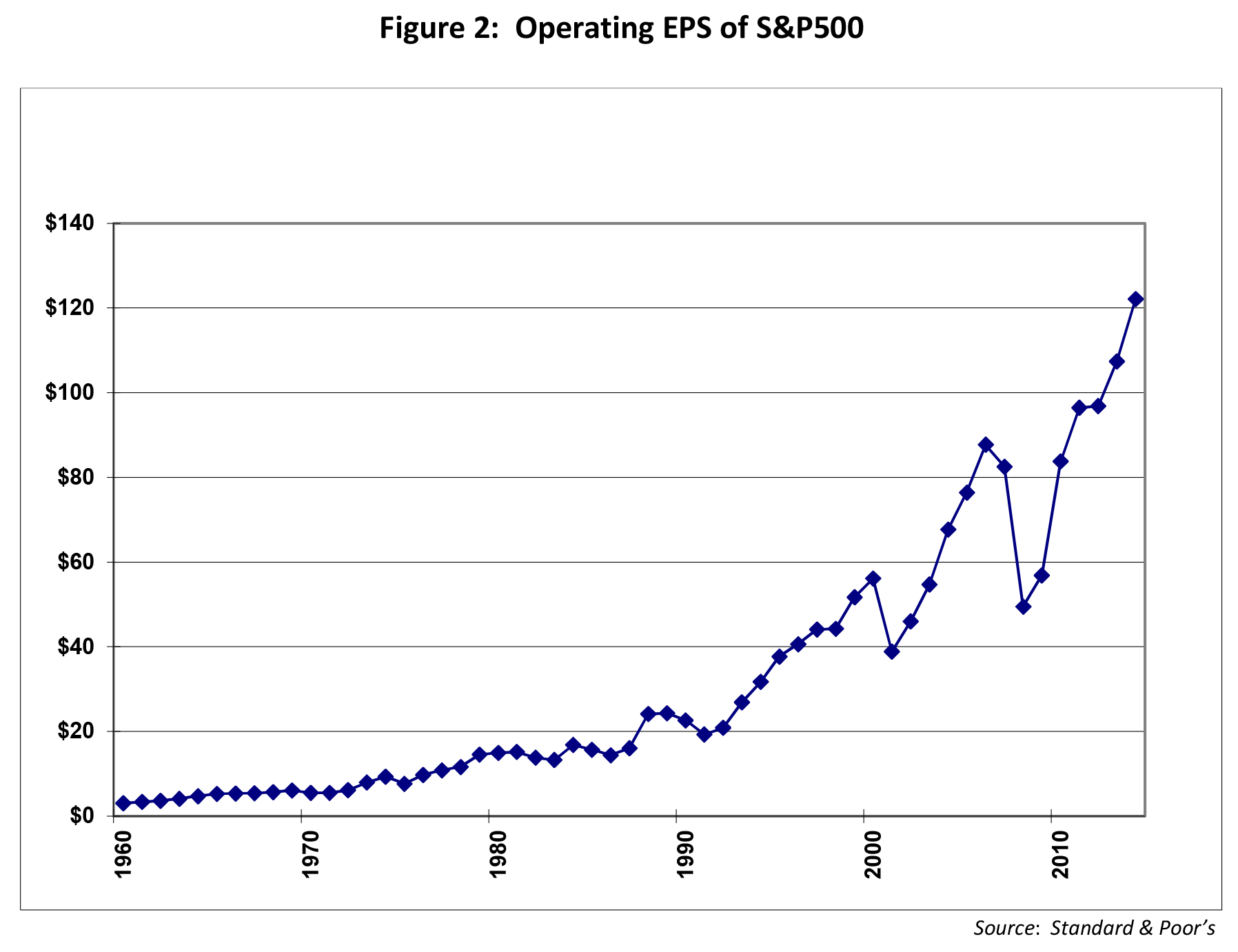
MONEY FLOWS
Despite the robust returns of US stocks since we began operations in 2010, investors have not clamored to join in on the action. Skepticism continues to reign about the current economic recovery. Table 1 below shows the flows into domestic equity funds and ETFs over the last 4 years. We estimate the ETF flows by calculating the flows into the largest domestic ETFs.

Clearly, investors have not bought into this rally as seen by the significant outflows. Amongst the explanations given for the wariness include, in no particular order:
The Federal Reserve is inducing the market to go up. Once the printing stops, the party will end.
Tapering by the Fed will lead to a rise in long-term rates which will in turn cause a hiccup in the stock market.
Another Great Recession is around the corner so it’s best to park savings in cash, safe bonds and gold.
Raising taxes (in 2013), government shutdowns, congressional gridlock, sequestration etc.
Affordable Care Act (Obamacare) will put the kibosh on employment growth
We did not buy into these dooms-day scenarios when we started Alamar as the recovery began and we do not agree with these sentiments now. As Warren Buffet has said “you pay a high price for a cheery consensus”. The price paid for sitting out this recovery, waiting for the dust to settle, has been high indeed.
THE ECONOMIC RECOVERY
In past writings we have depicted employment indicators to show that the current economic recovery remains on track. We will not repeat the metric this time but state that an updated graph of jobs created in this recovery is very similar to the trend seen in the previous recovery (2003). Instead of jobs we will look at consumer spending, representing two-thirds of the economy. A useful metric we track is the total spending on credit and debit cards as reported by the major card networks (Visa, MasterCard and American Express). Figure 3 depicts annualized US spending as measured by these companies.

As seen above, the spending pattern clearly shows the impact of the Great Recession in 2008/2009 and the upturn since then. US consumer spending is now 25% above the previous peak and the recovery remains on track.
CONCLUDING THOUGHTS
The economic recovery continues and the equity markets are anticipating a strengthening recovery as reflected in the robust 2013 returns. Investors, however, are not believers in this new bull market as seen by persistent outflows from domestic stock funds. Late last year there was a change in this trend when outflows abated and inflows rose moderately. It remains to be seen if this reflects a fundamental change in investor sentiment.
While replicating 20% plus annual returns will be difficult, we do believe more moderate returns are achievable over the next few years.
We wish everyone a prosperous 2014! Thank you for your continued trust and confidence in Alamar Capital Management.
Sincerely,
George Tharakan, CFA
george@alamarcapital.com
John Murphy, CFA
john@alamarcapital.com
Disclosures
The views expressed in this note are as of the date initially published and are subject to change without notice. Alamar has no obligation or duty to update the information contained in this note. Past performance is not an indication of future results. Risk is inherent in investments and involves the possibility of loss.
This publication is made available for informational purposes only and should not be used for any other purpose. In particular, this report should not be construed as a solicitation of an offer to buy or sell any security. Information contained herein was obtained and derived from independent third-party sources. Alamar Capital Management, LLC believes the sources are reliable; however, it cannot guarantee the accuracy of such information and has not independently verified the accuracy or completeness of such information.
This publication, and the information contained herein, may not be copied, reproduced, republished, or posted in whole or in part, in any form or media without the prior written consent of Alamar Capital.
ACM Commentary 3Q 2013
MARKET SUMMARY
With the close of the 3rd quarter the S&P 500 achieved a 5.2% return and is now up 19.8% on the year. During the same period, the Russell 3000, a broader based index comprised of some smaller companies by market capitalization returned 6.4% for the quarter and 21.3%, respectively. The bull market marches on.
For our part, Alamar was up net of fees 10.3% in 3Q and 27.1% YTD. Further, we experienced something of a watershed moment in the early innings of the 4th quarter, as investors who had been with us since our inception on January 1, 2010, witnessed their initial investment double after fees. Granted, with the equity markets now having provided almost 4 full years of attractive returns, our timing has been fortunate. We have exceeded our own expectations and do not anticipate providing the same level of returns going forward. That being said, we are pleased with our progress on an absolute and risk adjusted basis and remain both realistic and optimistic about the future.
At Alamar, we have the opportunity to meet with a lot of individual and institutional investors to discuss the positioning of their portfolios. We have noticed that many are frustrated of being too conservatively positioned for the market’s recent rally, while at the same time skeptical of the rally itself. As a result, we’ve been thinking a lot about the concept of market sentiment lately and the powerful role it plays in investing. As bottom up fundamental investors, the idea that many investors are scared when they should be greedy and greedy when they should be scared has always intrigued us, namely because we try to profit from it. It’s also what convinces us that markets are inefficient, sometimes more so than others. We thought we would touch on market sentiment with this market summary, and share with you how we respond to it at Alamar, and lastly, offer a suggestion that might be appealing to some investors. We continue to believe that investors must engage in risk assets with at least a portion of their assets.
MARKET SENTIMENT
Market sentiment is defined as the overall attitude of investors toward a particular security or larger financial market. It is the tone of a market, or its crowd psychology, as revealed through the activity and price movement of the securities traded in that market. For example, rising prices would indicate a bullish market sentiment, while falling prices would indicate a bearish market sentiment. The takeaway is that market sentiment is based on feelings not fundamentals.
Let’s start first with a question – Was our country more or less safe on September 12th 2001? The tragedy of 9/11 convinced all of us that the world could be a very dangerous place, but it also brought into question our perception of safety in the days leading up to the tragedy itself. While at the same time, one could argue that our collective adjustment and heightened alert, made us safer in some respects on 9/12, though it sure didn’t “feel” that way. Of course none of us will ever forget the horrific events that unfolded that morning, but perhaps we think about them a bit less with each passing day.
This same concept can easily be applied to investment markets. Market sentiment is what allows us to sometimes look at the same financial data point in incongruent ways. For instance, it is how the S&P 500 trading at 40x earnings can seem cheap in one context, while a 12x multiple can feel expensive in another. Obviously, earnings growth, interest rates and other variables play a large role, but you get the idea that we have a tendency of thinking both the good and the bad times are going to last forever.
Here is a helpful chart that we think speaks directly to the notion of Market Sentiment.

In general, many investors felt comfortable with their financial affairs in March 2000 and October 2007, but in hindsight of course, they shouldn’t have. They were made aware of this by two painful crises that by October 2002 and March of 2009 saw peak to trough corrections of 49% and 57% respectively. Clearly these traumatic events had a strong impact on the psyche of investors, which changed their perspective on the environment around them. Unfortunately, more often than not investors readjust their portfolios more conservatively in reaction to a crisis, as opposed to in preparation for one.
Sure, it would be great to be able to time the market in order to avoid these corrections and many are tempted to do so, but it turns out that it’s really tough to time human emotion. This is because the periods of euphoria last longer than many of us imagine possible, while the corrections are often almost instantaneous (Remember the housing boom?).
We believe the 2007-‘08 crisis and its relationship to the dot com correction, provides an interesting parallel for our current market environment and aptly displays the role that market sentiment is playing in investors lives today.
2007 – PRESENT DAY
It seems apparent now that the benign investment environment and outsized returns from 2003-2007 had numbed investors senses and reduced their fears associated with the dot com bust years earlier. Further, low interest rates and excessive leverage encouraged many to extend their risk profiles and reach for yield. Of course, in an effort to stimulate the economy, the Fed played a role in all of this by keeping rates too low for too long (sound familiar?). In essence, people slowly forgot about the painful correction from 2000-2002 and greed took hold. Unfortunately, periods like these often provide the greatest reward to market participants taking the most risk, which creates something of a negative feedback loop. Oftentimes, it seems as though it is not until the last investor joins the party that the underlying risk in the system, or in this case default rates, reveals itself. As a result, some risk-averse investors enjoy few of the markets gains, while experiencing a lot of its downside. This serves as a reminder that how we feel about the market should have little to no relevance as to whether or not we should be invested.
The crisis that began in 2007 was particularly painful for three reasons. First, its sheer size and magnitude was something that no one alive at the time had ever witnessed before. Second, it forced many younger investors back into the abyss at a time when they had finally recouped losses from the dot com era. Lastly, the large baby boomer demographic who had grown accustomed to the outsize returns in the 80’s and 90’s were caught unawares and overweight to risk, just as many were preparing to retire. As a result, market sentiment plummeted.
Additionally, the market’s correction in 2008 and 2009 was extremely wide and deep, affecting almost all equity asset classes with equal ferocity. The merits of diversification proved helpless and were challenged as correlations amongst different asset classes approached 1 and all simultaneously fell precipitously, save fixed income. Many individual investors retreated to the safety of cash and bonds, and a lot of the investment advisors who serve them, responded as well. From what we can tell, it appears that some advisors attempted to preserve capital and their clients through exposure to increasingly risk-averse portfolios and an ever increasing number of mutual funds and ETF’s (Exchange Traded Funds). As a result, portfolios that were not prepared heading into the crisis were subsequently now unprepared for its recovery, securing a permanent loss of capital.
The good news in all of this is that the negative sentiment created an opportunity in the form of a lot of low hanging fruit for long term investors, like Alamar, who were able to buy the shares of solid companies at extremely attractive valuations. Over time, along with an assist from the Fed (again), and subtly improving fundamentals, the value of these shares has risen dramatically. This has not gone unnoticed by some former skeptics who have converted from a bearish to bullish stance and further bid up shares. You know how the rest of the story goes. At the end of the 3Q, the S&P 500 was up 150% since the March 2009 lows. Figure 2 below puts the extent of the recovery in dollar terms and shows the growth of one million dollars since Alamar’s inception January 1, 2010. As we mentioned earlier, many investors have not participated in this rally to the extent they would have liked, while at the same time they have not forgotten the pain from the two prior corrections. Further, many Boomers in particular, feel they do not have the time to recover in the event they participate in yet another significant decline. To make matters worse, after 30 years of relative calm, a recent interest rate shock has reacquainted them of the risk in an asset they had come to view as risk-less, dramatically changing market sentiment on the bond market in the process.

Without question, we are coming out of a period of extreme negative investor sentiment and for good reason. What investors now have to decide is given the recent run up, has the market raced ahead of the fundamentals yet again, or can it be justified at these levels by an economy in recovery.
ALAMAR’S VIEW
In looking at the data Alamar does not believe that current market prices reflect too much investor enthusiasm. In our estimation sentiment has turned from a previously unheard of negative to something closer to middle of the road. Though we are not finding nearly as many bargains as we used to, we are still finding some, which is a sign to us that the market is normalizing.
At Alamar, we formulate our own independent views on the macro economy by reading the annual and quarterly reports of 100’s of individual companies each year. We believe that this approach works to insulate us from the Wall Street herd. When we can’t find ideas, cash levels rise in our portfolio, and when we grow concerned about valuation risk in the businesses we own, we sell shares. Currently, our cash position is around 15% – a bit cautionary but still participating in the market.
As a result of our approach, ideally we will come into frothy markets holding more cash, meaning we will not capture as much of the later stages of a market rally. Conversely, the excess cash acts as a valuable source of capital preservation and can also be put to work when valuations become more attractive down the road. Further, when we grow particularly concerned about the fundamentals of the economy, we purchase put options as a means to insure against downside risk. We do not currently own any put options at this time. We believe that all this results in an investment process that, on the margins, is more proactive than reactive. Again, we do not think it is possible to completely time the market.
The companies in our portfolio are currently in the midst of reporting their quarterly earnings, and we are quite pleased with their performance so far. We now anticipate profit growth in 3Q of over 10%, which is significantly higher than the overall economy and our initial expectations. Also, the uncertainty in the market is healthy and probably a good thing over the intermediate term.
However, in some respects the signals remain mixed. We continue to struggle with many of the problems that have plagued us in the past, an indication that we are not properly acknowledging and dealing with them – a bad sign. Even worse, our elected officials appear incapable of providing true leadership, and delivering difficult and unpopular policies on issues we must eventually confront such as the national debt, social security, and pension reform – also a bad sign. So given all of this, what should a thoughtful investor do?
HORSE RACE
In recent months Alamar has come to recognize that several of our newer clients have elected to hire us as an addition to, or hedge against, investments they hold elsewhere. This scenario creates something of a horse race between their current positioning, and our collection of stocks and in some cases high yield bonds. We think this idea makes for an attractive compromise for investors yearning for more market participation.
CONCLUDING REMARKS
In summary, Investors face a conundrum heading into 2014. Alamar strongly suggests that investors not allow emotion to be their guide. Reading the news gives cause for concern. There are the known unknowns – political dysfunction in Washington DC and the Fed taper to name a few. Plus, the truly unexpected that may come out of the blue. It’s tempting to avoid these risks by investing in the perceived safety of bonds, and holding lots of cash. However, this investor pays a heavy price for the illusion of safety. Investing a portion of your savings in risk assets should be considered.
Thanks for taking the time to read our report. We welcome your thoughts and feedback. Also, please feel free to forward our writings to others you feel might like to read them.
Sincerely,
John Murphy, CFA
john@alamarcapital.com
George Tharakan, CFA
george@alamarcapital.com
Disclosures
The views expressed in this note are as of the date initially published and are subject to change without notice. Alamar has no obligation or duty to update the information contained in this note. Past performance is not an indication of future results. Risk is inherent in investments and involves the possibility of loss.
This publication is made available for informational purposes only and should not be used for any other purpose. In particular, this report should not be construed as a solicitation of an offer to buy or sell any security. Information contained herein was obtained and derived from independent third-party sources. Alamar Capital Management, LLC believes the sources are reliable; however, it cannot guarantee the accuracy of such information and has not independently verified the accuracy or completeness of such information.
This publication, and the information contained herein, may not be copied, reproduced, republished, or posted in whole or in part, in any form or media without the prior written consent of Alamar Capital.
ACM Commentary 2Q 2013
The market rally continues as fear and skepticism slowly give way to greed. Coming into the year investors were worried about the impact of higher taxes and reduced government spending on the economy and the markets. Despite these macroeconomic headwinds the US economy continues to motor higher and the stock market even more so. The new investor worry is the tapering of treasury purchases (and thus money printing) by the Federal Reserve. Some investors believe that the economy is levitating on the back of copious liquidity generated by Fed money printing. Take away the printing press and voila the economy sinks into the doldrums. We are not avid followers of this school of thought. We believe the economy can overcome this hurdle, too. Through the second quarter we are up 15.3% for the year, after fees, while the S&P500 is up 13.8%. Since inception in 2010 we are up 74.3% cumulatively, net of fees, and the S&P500 is up 54.7%.
During the quarter we had the opportunity to attend the always interesting UCSB Economic Forecast Project. One of the speakers at the conference made a comment that grabbed our attention. He suggested that higher capital requirements, as mandated by Dodd-Frank, will necessarily lead to less bank lending and act as another economic headwind. This note will explore this concept further.
This writing will also evaluate the health of the US consumer, the primary driver of the economy. Specifically, we will look at the relative positions of the wealthy and the rest.
BANK LENDING IN THE FACE OF HIGHER CAPITAL
The typical narrative from the banking industry is that higher capital requirements will lead to less lending. While this argument has some merit, we feel there are countervailing forces unleashed that could spur lending due to higher capital requirements. For instance, a bank with a large capital cushion can take more lending risks than a bank backed with less capital. All else equal, regulators will be less concerned with a well-capitalized bank growing its loan book compared to a thinly capitalized bank.
Instead of speculating on hypothetical scenarios we decided to look at the empirical data. We gathered a list of the largest national banks (Bank of America, JP Morgan, Wells Fargo, and Citigroup), super-regionals (Capital One, BB&T, PNC Corp, US Bancorp, and SunTrust) and some smaller regional banks. In total, these banks had over $4 Trillion in loans outstanding as of the end of 2012. Loan growth from 2011 to 2012 of this sample of banks was compared to tangible equity capital. We think tangible equity capital as a percent of total assets is a good measure of the capacity of a bank to sustain loan losses without resorting to bailouts by taxpayers. Figure 1 plots loan growth to tangible equity capital.

Figure 1 depicts that the relationship between loan growth and equity capital is not very clear. However, with the exception of one bank (Regions Financial), there is a trend of well capitalized banks showing better loan growth. The Dodd-Frank bill requires regulators to emphasize higher capital requirements as the first line of defense in case of a financial crisis. We believe, based on the evidence shown above, that not only will the banking industry be more resilient but will also exhibit better loan growth from higher capital.
THE PORSCHE INDICATOR
One of the primary avenues the Federal Reserve is using to jump-start the US economy is through the wealth-effect. In a nutshell, the economic theory of the wealth effect posits that if consumers feel wealthy from inflated assets they will spend more money. The Fed, following this dictum, is attempting to get the party going. It has lowered short-term rates to almost 0% to spur borrowing and it has printed money to buy long-term treasuries to lower long-term rates as well. Lower rates have spurred investors to invest in more risky assets thus pushing prices of risky assets higher. The primary beneficiaries of this Fed largesse has been the wealthy who own a disproportionate share of risk assets such as stocks and corporate bonds. And the wealthy segment of the population is following through just as the Fed postulated. Nowhere is this more apparent than in the sales of the perennial rich-man’s toy, Porsche. Figure 2 depicts the US sales of Porsche vehicles in contrast to total automobile sales since 2001. Since Porsche represents less than 0.5% of the overall market, we have indexed both series to 100 at the beginning for ease of depiction.

As shown in the figure, starting in 2008 Porsche sales began to fall as the recession began to bite the high-end consumer. From the peak, Porsche sales fell 43% while the overall market fell 39%. Both the overall market and Porsche saw a recovery in 2010 which has continued to this day. Note, however, that the overall market has yet to reach its prior heights while Porsche is well above the peak reached in 2007. Sales this year are on track to be 30% above the prior peak! The wealth effect is in high gear.
THE HELICOPTER IS READY TO GET SOME REST
On June 19, 2013 Ben Bernanke, in his post-FOMC meeting press conference, uttered the following words:
“If the incoming data are broadly consistent with this forecast, the Committee currently anticipates that it would be appropriate to moderate the monthly pace of purchases later this year; and if subsequent data remain broadly aligned with our current expectations for the economy, we would continue to reduce the pace of purchases in measured steps through the first half of next year, ending purchases around midyear. In this scenario, when asset purchases ultimately come to an end, the unemployment rate would likely be in the vicinity of 7%, with solid economic growth supporting further job gains – a substantial improvement from the 8.1% unemployment rate that prevailed when the Committee announced this program.”
If the economy continues its current pace of growth, quantitative easing (i.e. money printing) will finally come to an end by the middle of next year. Bernanke will give his helicopter some well needed rest. He emphasized, however, that the Fed Funds rate will stay at 0.25% until the unemployment rate drops to at least 6.5%. Investors were clearly not pleased with the hint of an end to money printing. The S&P500 promptly dropped almost 4% led by stocks paying high dividends. The Utilities, Consumer Staples and Telecom sectors were all down 5% or more. As to be expected, Gold, the safe haven asset, was down over 5%. There is a pervasive belief amongst investors promulgated primarily by the Federal Reserve that money printing has helped lift the economy from the doldrums. It follows, therefore, that the withdrawal of the money printing medicine will send the economy back to the sick bed. No one can say for certain how much of an impact money-printing has had on the economy. It has clearly had an impact on long-term Treasuries and other income-producing safe assets as seen by the effect on high-dividend stocks. We continue to expect a slow, anemic economic recovery with or without quantitative easing.
CONCLUSION
We believe higher capital requirements for banks, as mandated by the Dodd-Frank act, will be beneficial for the economy and will spur loan growth. Quantitative easing by the Federal Reserve has lifted asset prices but seems to have disproportionately benefited the wealthy. It is not clear to us if the withdrawal of money-printing will have a severe impact on the economy but could affect certain perceived low-risk, income producing asset classes.
For our part, we continue to focus on identifying and investing in companies that meet our criteria for investment – solid businesses with attractive growth prospects trading at reasonable prices.
We welcome comments and feedback. If you would like to receive future commentary from us or know of others who would appreciate our thoughts please let us know.
George Tharakan, CFA
george@alamarcapital.com
John Murphy, CFA
john@alamarcapital.com
Disclosures
The views expressed in this note are as of the date initially published and are subject to change without notice. Alamar has no obligation or duty to update the information contained in this note. Past performance is not an indication of future results. Risk is inherent in investments and involves the possibility of loss.
This publication is made available for informational purposes only and should not be used for any other purpose. In particular, this report should not be construed as a solicitation of an offer to buy or sell any security. Information contained herein was obtained and derived from independent third-party sources. Alamar Capital Management, LLC believes the sources are reliable; however, it cannot guarantee the accuracy of such information and has not independently verified the accuracy or completeness of such information.
This publication, and the information contained herein, may not be copied, reproduced, republished, or posted in whole or in part, in any form or media without the prior written consent of Alamar Capital.
ACM Commentary 1Q 2013
MARKET SUMMARY
The first quarter of 2013 provided another attractive return for stock investors. With a 10.6% return on the quarter for the S&P 500, the bull market that dates back to March 2009 stretches remarkably into its fifth calendar year. Alamar achieved a 10.2% return in Q1 2013 for our All Cap strategy. We are pleased to report the strategy is now up 18.1% annualized since our inception January 1, 2010 compared to a 13.5% return for the S&P 500 and a 13.9% return for the Russell 3000, an index comprised of slightly smaller market cap names.
Since the close of the first quarter, the market continues to churn higher, with both the S&P 500 and Dow reaching new all-time highs. Meanwhile, first quarter earnings and anecdotal macro data reveal a cooling economy, while 10 Year US Treasury bonds have fallen to just 1.7%. This has led some to speculate that the recent enthusiasm for equities is more reflective of anticipated additional coordinated central bank stimulus than a growing and healthy economy. This is a reversal of course from discussions of belt tightening by the Fed just a couple of weeks ago.
Moving on to corporate earnings, the Q1 season so far has shown many US companies struggling to generate meaningful revenue growth. For example, according to Factset, of the 271 companies that have reported earnings to date for the quarter, 73% reported earnings above the mean estimate while only 44% reported revenues above the mean estimate. This is really nothing new. Since the trough of 2009, S&P 500 operating earnings have risen almost 100% from about $65 to almost $115, while revenue has increased just 26% over the same time period. With so little pricing power in the overall economy, the only route to profit has been cost cutting. As a result job growth and wage increases have been anemic, while productivity gains and profit margins reside at all-time highs. Despite this headwind, as well as a recent payroll tax hike, and higher gas prices, the consumer has proven resilient, increasing spending in Q1 to offset cuts in government spending. Not surprisingly, this increase has come at the expense of savings, bringing into question its sustainability. All told, US GDP grew a modest 2.5% in Q1, while China climbed 7.7%, both missing analyst estimates.
Given the strong recent out-performance in the more defensive sectors of the market, we thought we would take a look at it with the remainder of this quarter’s commentary.
CHASING THE DREAM
Figure 1 below shows the performance of the S&P 500 by economic sector in the most recent quarter and over the last several years. What is telling to us about this data is the extent of the outperformance amongst non-cyclical stocks. These sectors such as Health Care, Consumer Staples and Utilities, are viewed as being defensive in nature and something of a safe haven for risk-averse equity investors. Historically, when defensive sectors lead the market, it has tended to be a sign of a top in the making and a reflection of a slowing economy. However, in the case of Health Care and Consumer Staples, these sectors have not just out-performed the market in the most recent quarter, but over the entire time period! At the same time, cyclical names like Materials and Technology, typically associated with a recovering economy, have continued to lag.

This is clearly a sign of an economy struggling to get off the ground, but we believe it can be attributed to investor behavior as well. Specifically, income hungry investors are tip-toeing back into the market through stocks perceived as being less risky. Sensing an opportunity, Wall Street appears to have reacted to this through the creation of a plethora of “low volatility” funds and ETF’s with heavy exposure to defensive areas of the market. Allocations to these funds then bid up the shares of the companies they own and valuations increase. Let’s get into this in greater detail.
Figure 2 below provides mutual fund flows dating back several years, and indicates a measure of enthusiasm for stock vs. bonds. It also compares the performance of the two asset classes. The data clearly shows a shaken investor exiting equities for the safety of bonds starting in 2008, and earning a substantially lower comparative return since.

The last 4 years has seen an incredible $300+ billion in outflow from equity funds and an over $1 trillion inflow to bonds. Figures on ETF flows would offset these numbers somewhat over the time period, but we use mutual fund flows here because we feel they still best describe retail behavior.
The data above also addresses the media’s current fascination about an anticipated “Great Rotation” out of bonds and cash into equities, which appears to be taking shape. In the first quarter, investors who have missed out on much of the rally and are frustrated with the low returns available in cash and fixed income, have finally increased allocations to equities, chasing the performance that has been generated there.
We believe it is likely investors who have stayed the course, or have allocated to equities since the ‘08 crisis, have done so by and large cautiously and the performance of defensive stocks is indicative of this. An area where this phenomenon can be measured is in the growing ETF market. For instance, a recently established Low Volatility ETF fund provides a prime example of the current appetite for non-cyclical stocks. The Powershares S&P 500 Low Volatility Portfolio (SPLV) has gathered over $5.4 billion in assets since it was formed in May 2011! Figure 3 below shows a brief overview of the fund and its positioning. We chose an ETF here because we feel it best represents Wall Street behavior.

As you can see, over 50% of this fund is currently allocated to Utilities and Defensive names, many of which now trade at over 20x earnings. Just as mutual fund investors may be a little late to the party with their return to equities, risk-averse ETF investors may also end up disappointed if there is a sector rotation away from defensive ones and cyclical sectors start pacing the market. The question now is how much longer this trend can continue. Wall St. itself has never been known as a trend setter and the timing and establishment of this fund and others like it is itself a bit curious, but profitable nonetheless.
CONCLUSION
For our part, we continue to focus on identifying and investing in companies that meet our criteria for investment – solid businesses with attractive growth prospects trading at reasonable prices.
During the first quarter two of our investments were acquired for hefty premiums. One, Life Technologies Corp (LIFE) was acquired by another public company, Thermo Fisher Scientific. The other, Gardner Denver Inc. (GDI) was acquired by private equity firm KKR. Ironically, both LIFE and GDI would be classified as being more cyclical in nature. It is likely that this will continue in the future as companies struggling to generate meaningful organic growth acquire it through the purchase of businesses with clean balance sheets and decent growth prospects. These types of companies are all the more appealing since they have not been attracting a lot of interest in the public markets.
We welcome comments and feedback. If you would like to receive future commentary from us or know of others who would appreciate our thoughts please let us know.
John Murphy, CFA
john@alamarcapital.com
George Tharakan, CFA
george@alamarcapital.com
Disclosures
The views expressed in this note are as of the date initially published and are subject to change without notice. Alamar has no obligation or duty to update the information contained in this note. Past performance is not an indication of future results. Risk is inherent in investments and involves the possibility of loss.
This publication is made available for informational purposes only and should not be used for any other purpose. In particular, this report should not be construed as a solicitation of an offer to buy or sell any security. Information contained herein was obtained and derived from independent third-party sources. Alamar Capital Management, LLC believes the sources are reliable; however, it cannot guarantee the accuracy of such information and has not independently verified the accuracy or completeness of such information.
This publication, and the information contained herein, may not be copied, reproduced, republished, or posted in whole or in part, in any form or media without the prior written consent of Alamar Capital.
ACM Commentary 4Q 2012
After all the handwringing about the presidential elections, Europe, and the fiscal cliff, the markets performed admirably in 2012. The S&P500 was up 16.1%, substantially above long-run returns and more than twice the growth of overall corporate profits and gross domestic product (GDP). We were up roughly 12% last year, net of fees. Our shortfall was entirely from our lack of exposure to banks (up roughly 30%) and Apple (up 33%). Since inception three years ago, we are up over 51%, cumulatively, while the S&P500 returned 36%.
Given the intense focus on government budgets we will spend some time in this writing on fiscal affairs. We will also look at the employment picture and compare our current situation to past cycles.
THE EMPLOYMENT PICTURE
The economy, to the extent we can fathom, is recovering, albeit at a very moderate pace. Figure 1 below plots the job picture including the December 2012 release. The recovery that began in 2010 continues on pace. We have now passed the employment peak of 2001. If we continue on the current trajectory we will pass the 2008 employment peak in a little over two years. However, this recovery is quite anemic compared to the prior two. Figure 2 plots the pace of job growth from the inception of each cycle. Despite the large fiscal and monetary stimuli the gap between the current cycle and the previous two is beginning to widen.

DO WE HAVE A DEAL?
The bigger overhang on the economy and for investors is the fiscal cliff and debt limit negotiations. The fiscal cliff seems to have been temporarily forestalled by increasing taxes on the wealthy and capping spending until next month. The primary differences between the two sides are the levels of taxation and spending by the federal government. We believe we are well on our way to resolving these issues.
Figure 3 plots the receipts (taxes, social security and Medicare) of the federal government as a percentage of the overall economy (GDP) post WWII. The historical average, as shown by the dotted blue line, has been 17.5%. Receipts fall during recessions and rise as the economy recovers. During the recent Great Recession receipts bottomed at 15.1% in 2009 and are now beginning to recover. Receipts in 2013 are expected to reach the long-term average of 17.5%.

Figure 4 plots the other side of the coin, spending. In contrast to receipts, spending typically rises during recessions as the government attempts to offset the drop-off in aggregate private sector demand with stimulus. In 2009, spending spiked to a post-WWII high of 25% of GDP as Keynesian doctrine kicked into high gear. Spending drops off as the economy begins to recover and the private sector picks up the slack. Historically, post WWII, total federal spending has averaged 19.2% of GDP as shown by the red line. Figure 4 plots two trajectories of future spending. The blue line depicts the projections as defined by the most recent treasury budget.
However, the US Congress, in particular the House of Representatives, has refused to sign off on spending increases. As a result, the actual spending, as shown in Figure 5, has remained constrained due to the budget stalemate. Since mid-2009, federal spending has flat-lined at roughly $300 Billion monthly. If this spending restraint continues going forward then spending as a percentage of GDP will follow the trajectory as shown by the green line in Figure 4. In two years, spending will fall back to historical averages and then fall below, provided we continue on the current track!


CONCLUDING THOUGHTS
The economy is slowly picking up pace as exhibited by moderate job growth. The recovery, thus far, has been sub-par compared to previous recoveries. According to research from Carmen Reinhart and Kenneth Rogoff, this is par for the course following recessions caused by financial crises.
The budget brouhaha in Washington, the focus of everyone’s attention, is from our vantage point, on the mend. Paradoxically, the stalemate in Congress is actually helping to improve the fiscal situation by keeping spending in check as tax receipts improve with the growing economy.
While we are a tad more constructive on the equity market from our previous quarterly missive, we are not ready to call the all-clear. Continuing outflows from the equity market is a good sign since that keeps expectations in check. However, corporate earnings growth is anemic which makes us a bit cautious.
Thank you for your continued consideration of our firm.
Sincerely,
George Tharakan, CFA
george@alamarcapital.com
John Murphy, CFA
john@alamarcapital.com
Disclosures
The views expressed in this note are as of the date initially published and are subject to change
without notice. Alamar has no obligation or duty to update the information contained in this
note. Past performance is not an indication of future results. Risk is inherent in investments
and involves the possibility of loss.
This publication is made available for informational purposes only and should not be used for
any other purpose. In particular, this report should not be construed as a solicitation of an
offer to buy or sell any security. Information contained herein was obtained and derived from
independent third-party sources. Alamar Capital Management, LLC believes the sources are
reliable; however, it cannot guarantee the accuracy of such information and has not
independently verified the accuracy or completeness of such information.
This publication, and the information contained herein, may not be copied, reproduced,
republished, or posted in whole or in part, in any form or media without the prior written
consent of Alamar Capital.
ACM Commentary 3Q 2012
This quarter we will depart from our normal practice and discuss our thinking on a popular stock, albeit one we have not invested in. We will also explain our views on the economy and the Federal Reserve’s latest round of quantitative easing. To preview, from our vantage point, the economy is showing signs of weakening and we are somewhat cautious in our outlook.
ALL ABOARD
It is said that humankind’s original sin was taking a bite of the apple. The question at hand is why haven’t we succumbed to the temptation? After all, isn’t everybody enjoying the tasty gains provided by the most valuable company on the planet? We are referring of course to Apple Inc., the iPhone maker, not the fruit. Apple now represents the largest weighting in most broad market indices, exchange traded funds (ETFs), many hedge funds and large mutual funds. The stock is now up over 60% for the year and the company is valued at roughly $620 Billion. Approximately 15% of the S&P500’s return this year has come from this single stock! We are not aware of any stock that has had such a disproportionate impact on the broad market in the last 20 years. Clearly, not owning AAPL has had an impact on our performance versus market benchmarks this year. The obvious question that comes to mind is why don’t we like what everyone loves? Why do we, as Steve Jobs would say, “Think Different”?
When we purchase a stock we assume we are given the opportunity to buy the entire company. To purchase a share of Apple therefore implies we are willing to pay $620 Billion (or $500 Billion net of cash on the balance sheet to be more precise) for the entire company. Since we expect at least a 10% return on this investment, the company would have to generate 10% of $500 Billion or $50 Billion annually in profits in perpetuity. We attempted to estimate the odds of a company achieving this happy outcome. For our analysis, we looked at the historical reported profits of all 500 companies in the S&P 500 going back to 1980. In order to make it a relevant comparison to the present circumstance, we adjusted all the profits for inflation so that all the numbers can be compared to current dollar values.
Remarkably, over the last 30 years, not a single company has ever reported profits close to $50 Billion, adjusted for inflation. The only company that came close to the mark was ExxonMobil which reported $47 Billion in 2008. Citigroup follows ExxonMobil at $28 Billion in 2005, at the peak of the housing bubble. Citigroup is closely followed by another Oil & Gas major, Chevron, at $27 Billion in 2011. Table 1 depicts the frequency of large-profit years for all 500 companies over the last 30 years. For ease of illustration we have only shown occurrences of profits above $5 Billion in any single year. The probability of reporting profits greater than $25 Billion in any single year is roughly 1 in 1,000.

Another interesting discovery is that few companies have been able to sustain their profits at these lofty heights. As is typified by Citigroup, the big profits are maintained only for a year or two before falling off dramatically. Only ExxonMobil has put together a string of profits above $20 Billion for more than 3 years, no one else comes close! The other large companies have difficulty sustaining their profits for long periods of time and inevitably succumb to competitive shifts in the marketplace.
The inevitable conclusion we reach after studying historical data is the odds of a company generating $50 Billion in profits in any single year is extremely remote and the probability of maintaining such profits is non-existent. We have therefore passed on the opportunity to jump on the Apple bandwagon despite the temptations and the painful experiences of watching it from the sidelines.
QE FOREVER
On September 13, Ben Bernanke, the Chairman of the Federal Reserve, announced the onset of yet another round of quantitative easing (QE) or, to put it bluntly, money printing. This will be the 3rd round of printing and this one has no time limit. The Fed will print $40 Billion every month and buy mortgage backed securities (MBS) until unemployment comes down to a currently undefined satisfactory level. The Bank of Japan (BOJ) soon followed suit and announced another round of QE. Japan has been engaged in money printing since their housing bubble burst in 1991, to no avail. Figure 1 depicts Japan’s monetary base as a % of GDP with a comparison to the US. All this money printing has done little to lift Japan from its economic doldrums. Similarly, the Fed’s QE 1 (September 2008) and QE 2 (November 2010) has done little to lift our economy. After a pickup last year, we saw a noticeable slowdown starting near the end of the second quarter, which has continued.

One of many metrics we track at Alamar is the total electricity generation in the US. Electricity usage is highly correlated with economic growth. A growing economy uses more electric power for industrial and household usage while a slowing economy uses less. Figure 2 exhibits electricity usage in the US since the beginning of the recession in late 2007. The graph clearly shows the decline in usage during the recession in 2008 and the pickup starting in late 2009. However, after a brief upturn, usage has begun to decline once again. Even though the government reports that GDP is growing once again and has exceeded the 2007 peak, the electricity usage statistics do not confirm this trend.

Despite this and other signs pointing to a weakening economy the stock market continues to march higher. This is quite possibly in response to Federal Reserve actions since Chairman Bernanke has been very explicit about his aims to lift the stock market through monetary policies. In the Q&A after the latest QE announcement, Bernanke, in response to a question about the motivations for the latest round of money printing, had this to say:
“Stock prices — many people own stocks directly or indirectly. The issue here is whether or not improving asset prices generally will make people more willing to spend. One of the main concerns that firms have is there’s not enough demand. There are not enough people coming and demanding their products. And if people feel that their financial situation is better because their 401(k) looks better or for whatever reason — their house is worth more — they’re more willing to go out and spend, and that’s going to provide the demand that firms need in order to be willing to hire and to invest.”
Nowhere in the Federal Reserve Act is there a mandate for the Federal Reserve to manipulate stock prices. We have already seen the aftermath of stock market and housing bubbles enabled by Fed policies in the last decade. To deliberately go about inflating yet another bubble after the dismal failures of the previous two is tantamount to gross ineptitude. The fact that only one individual objected and voted against this continuing madness is tragic.
CONCLUDING THOUGHTS
We live in interesting times. Despite clear signs of economic weakness the market continues to march higher. Professional and individual investors have crowded into some well-known stocks that are contributing a disproportionate share of total market returns. These stocks happen to have very large weightings in market indices and benefit from inflows into ETFs that track market benchmarks. The odds of these companies continuing to generate very large profits are exceedingly low; nevertheless the momentum propels these stocks forward.
The Federal Reserve, despite all evidence to the contrary, continues to believe in the magic of money printing. They are now engaged in a third round of quantitative easing with the explicit purpose of generating employment by manipulating stock and home prices. We have been down this road before, to no avail. Japan has been doing this for over two decades, to no avail. Indeed, if this policy actually did work then Zimbabwe would be the richest country in the world! Einstein once observed: “Insanity is doing the same thing over and over again expecting different results”. Perhaps this Federal Reserve will prove Einstein wrong.
We continue to be cautious investing in this environment. Accordingly, we have high levels of cash, precious metals and options for downside protection.
Thank you for your continued consideration of our firm.
Sincerely,
George Tharakan, CFA
george@alamarcapital.com
John Murphy, CFA
john@alamarcapital.com
Disclosures
The views expressed in this note are as of the date initially published and are subject to change without notice. Alamar has no obligation or duty to update the information contained in this note. Past performance is not an indication of future results. Risk is inherent in investments and involves the possibility of loss.
This publication is made available for informational purposes only and should not be used for any other purpose. In particular, this report should not be construed as a solicitation of an offer to buy or sell any security. Information contained herein was obtained and derived from independent third-party sources. Alamar Capital Management, LLC believes the sources are reliable; however, it cannot guarantee the accuracy of such information and has not independently verified the accuracy or completeness of such information.
This publication, and the information contained herein, may not be copied, reproduced, republished, or posted in whole or in part, in any form or media without the prior written consent of Alamar Capital.
ACM Commentary 2Q 2012
MID YEAR REVIEW
After one of the best first quarters in recent memory, the second quarter of 2012 saw a return of the volatility we experienced in each of the past two summers. Renewed fears surfaced, thanks in large part to a string of bad news out of Europe and weaker economic data in the U.S. and China. Additionally, the looming fiscal debt cliff, a highly polarized political environment, and pending U.S. elections, have added to near term uncertainty.
As a result, the S&P 500 gave up a portion of the gains it achieved in Q1 shedding 2.7% and is now up 9.5% for the year. Our All Cap strategy, after a tough month of May, was down 5.4% in the quarter, and is now up 9.2% (net) on the year. On a cumulative basis, since inception in 2010, the All Cap strategy is up 48.1% while the S&P500 is up 28.4%.
GROUNDHOG DAY
In response to this turmoil, the US Federal Reserve and the European Central Bank have again pledged additional Quantitative Easing (QE), and indicated there are more levers at their disposal to stimulate growth.
The markets have responded to this news favorably and bid up stock prices in the early part of the 3rd quarter on low volume. The NASDAQ is now up 16.5% ytd through the end of July and the S&P 500 has again approached near all-time highs, including reinvested dividends.
However, as we have discussed in prior writings, in the longer run, it is debatable the extent to which the Fed actions of the past, or future stimulus will achieve meaningful results for the overall economy. For instance, after 3 months of consistent gains to start 2012, job growth has slowed considerably since. Additionally, 2Q GDP was re-stated downward recently and forward forecasts have been reduced.
What Fed policy has done is drive yields down and asset prices up. The chart on the following page shows the S&P 500’s and 10 Year Treasury’s reaction to QE over the past 5 years.


In an Op-Ed piece written for The Washington Post, Chairman Bernanke was very clear about the intended impact of Quantitative Easing.
“This approach eased financial conditions in the past and, so far, looks to be effective again. Stock prices rose and long-term interest rates fell when investors began to anticipate the most recent action. Easier financial conditions will promote economic growth. For example, lower mortgage rates will make housing more affordable and allow more homeowners to refinance. Lower corporate bond rates will encourage investment. And higher stock prices will boost consumer wealth and help increase confidence, which can also spur spending. Increased spending will lead to higher incomes and profits that, in a virtuous circle, will further support economic expansion.”
Ben Bernanke, Fed Chairman – Washington Post
November 4th 2010
The chart shows the S&P 500 reacting positively to each announcement and subsequent stimulus, but also suffering a resultant headache as the punchbowl is taken away. It is important to note this effect appears to be dissipating over time with the magnitude and extent of each rally growing shorter.
Additionally, as interest rates are already low, and risk-premiums on more aggressive assets are already remarkably thin, the impact of further quantitative easing around the globe continues to show evidence of diminishing returns.
In this environment, savers and retirees are being penalized through artificially low rates that camouflage the true cost of borrowing for the governments that are racking up debt. The result, we believe, is that complacent and unsuspecting risk-averse investors are reaching out further up the yield curve to secure an attractive yield. Meanwhile, the debt continues to grow.

The willingness to embrace debt and deficits as a means to offset a financial crisis created by too much debt is obviously not unique to the US. The chart below displays the current debt burden carried by the U.S., the Euro Area and several countries in Europe.

The similarities are apparent, but where countries differ is in the cost associated with financing their debt. The considerable spikes in the 10 Year rates for Spain, Italy and elsewhere serve as a reminder to the rest of the world. On the other hand, Japan, whose debt to GDP exceeds 200%, enters its 3rd lost decade.
At Alamar, we have changed our tune as we enter the back half of 2012. As the year began, our view was that a heightened focus on the overall economy was overshadowing the fundamentals of individual businesses. As an example, our All Cap portfolio achieved a remarkable 20% year over year earnings growth in 1Q 2012. Earnings growth in the second quarter has decelerated dramatically to around 5% for our portfolio and even less for the S&P 500.
The graph below tells an interesting story of the S&P’s performance against Wall-Street analysts’ earnings revisions. Recent history shows the market pricing in anticipated Fed action, while analysts are reducing their expectations for profit growth. As stocks have continued to climb an uptick in those revisions is also evident, perhaps indicative of performance chasing.
CONCLUDING THOUGHTS
In an environment like this, where the short-term outlook is murky at best, we believe maintaining a long-term focus on solid businesses generating strong cash flows is the way to go. However, a number of indicators we track are showing cautionary signs on the US economy. Despite these warnings, the markets are rising to near all-time highs (when including reinvested dividends) which give us additional concerns. As a result, we expect the rest of the year to be volatile and have raised cash levels accordingly.
Thank you again for your continued consideration of our firm.
Sincerely,
John Murphy, CFA
john@alamarcapital.com
George Tharakan, CFA
george@alamarcapital.com
Disclosures
The views expressed in this note are as of the date initially published and are subject to change without notice. Alamar has no obligation or duty to update the information contained in this note. Past performance is not an indication of future results. Risk is inherent in investments and involves the possibility of loss.
This publication is made available for informational purposes only and should not be used for any other purpose. In particular, this report should not be construed as a solicitation of an offer to buy or sell any security. Information contained herein was obtained and derived from independent third-party sources. Alamar Capital Management, LLC believes the sources are reliable; however, it cannot guarantee the accuracy of such information and has not independently verified the accuracy or completeness of such information.
This publication, and the information contained herein, may not be copied, reproduced, republished, or posted in whole or in part, in any form or media without the prior written consent of Alamar Capital.
ACM Commentary 1Q 2012
The first quarter brought with it more good news for equity investors. With a 12.6% return for the S&P 500 in Q1, the bull market now stretches into its 4th year. Alamar was pleased to see our All Cap Strategy outperform in the quarter with a 15.8% return. Our portfolio of stocks has now achieved an annualized return of 23.2%, before fees, since inception (Jan 1, 2010), compared to a 13.2% return for the S&P 500. On a cumulative basis we are up 60% while the S&P500 is up 32%. Importantly, we have accomplished this without owning everyone’s favorite stock, Apple, during this period.
The S&P 500 closed the quarter at 1408, which was the best first quarter return for the index since 1998. Every sector in the index except Utilities (the best performer in 2011) saw a positive return with technology and financials leading the way. The stock market’s strong performance is pressuring both retail and institutional investors to reconsider their cash and other “risk free” (hardly) assets and to decide whether or not now is the time to enter the market. Bears argue that with productivity rates at all-time highs and earnings growth deceleration in 4Q 11, not to mention a massive deficit hang-over, a slowing China, and struggling European banks, the market is poised for correction. We don’t disagree that the road ahead will be bumpy.
However, with low relative P/E’s, clean balance sheets, and leaner organizations, stocks continue to demonstrate an ability to prosper in a high unemployment and challenging market environment. Granted, as is well publicized, the markets collectively have had heavy federal government assistance in the form of low interest rates and unprecedented monetary stimulus. Future market performance will in large part be predicated on the market’s ability to navigate a post stimulus environment, manage the global sovereign debt crisis, and continue to create meaningful jobs. An uptick in housing wouldn’t hurt either. At Alamar, we do not subscribe to short term thinking. In the long run, given the unprecedented levels of cash being held by corporations, and the host of unattractive low interest rate investment options available, we continue to contend that equity markets remain compelling.
To date, the recent run up in the market has had its share of ups and downs and the broader markets remain 10% or so below their October 2007 highs. However, a patient investor who bought the S&P 500 at those ‘07 highs and re-invested dividends is now very close to that high- water mark. It appears, though, that many market participants have not participated in the recovery.
FOLLOW THE MONEY
The following chart, provided by the Investment Company Institute, speaks to this point and shows the flow of funds into and out of mutual funds since 2008.

The data reveals that over the last 4+ years there have been $417 billion in outflows from mutual funds in equities and $874 billion in flows into bond funds. Additionally, at the current Q1 run rate, inflows to bonds for 2012 will be in excess of $300 billion. So, inflows to bonds not only continue, but at an accelerated pace! This despite of the fact that rates are artificially being kept at or near their all-time lows and the bull market for bonds now exceeds 30 years. In fact, even bond manager gurus Bill Gross (PIMCO) and Larry Fink (Blackrock) have recently questioned its longevity.
The next chart looks to identify the extent to which investors have been rewarded in recent years for their risk aversion. It compares the performance of the broader US Equity (S&P 500) and Bond Markets (Barclays Aggregate Bond Index) over the same time period.

Through 1Q 2012 the annualized return for these strategies since January 2008 is 1.2% for the S&P and 6.0% for the Barclays Aggregate. Clearly, a very savvy bond investor who predicted the ’08 crisis has been well served by avoiding the ’08 firestorm. However, as the funds data reveals, the much more likely scenario is of an investor who experienced the downturn, reduced exposure to equities, and has been out of the market or overweight to bonds the past few years. Since January 2009 the annualized return of the S&P 500 has been 17.1% while the aggregate bond index has achieved just a 6.3% return. Investors in cash, while preserving their capital, have earned almost nothing on their investment.
Another useful comparative technique involves looking at the earnings yield of a broad equity index against prevailing interest rates to determine whether stocks may be classified as over, or under-valued, compared to treasuries. The earnings yield, or inverse of the P/E ratio, assumes that 100% of earnings are paid out as income, in order to enable an apple to apple comparison to interest bearing investments. Figure 3 below compares the earnings yield of the S&P 500 against US 10 Year Treasuries dating back to 1960. The spread of that difference is calculated in the following chart.

Economic theory suggests that investors in equities should demand a risk premium over “risk free” assets to compensate them for the higher risk of owning stocks over bonds. The charts make a fairly compelling case for equities, given the growing disparity of the spread which, as of year-end, rivaled only that of the 1973-74 bear market in the time period. Further, it is debatable whether treasuries truly provide a risk free return in the current environment.
CONCLUDING THOUGHTS
At Alamar, we are comforted by the companies we own, the management teams that run them, and the bottom up fundamental investment philosophy we utilize. Also, contrary to what you may be hearing in the media, we believe the US economy, warts and all, is on the mend.
Investors need to evaluate whether investing in 10-year treasuries yielding 2%, with no hope for any future growth in income, is a better alternative than investing in stocks with an 8% current earnings yield and potential for future growth in earnings.
We welcome comments and feedback. If you would like to receive future commentary from us or know of others who would appreciate our thoughts please let us know.
John Murphy, CFA
john@alamarcapital.com
George Tharakan, CFA
george@alamarcapital.com
Disclosures
The views expressed in this note are as of the date initially published and are subject to change without notice. Alamar has no obligation or duty to update the information contained in this note. Past performance is not an indication of future results. Risk is inherent in investments and involves the possibility of loss.
This publication is made available for informational purposes only and should not be used for any other purpose. In particular, this report should not be construed as a solicitation of an offer to buy or sell any security. Information contained herein was obtained and derived from independent third-party sources. Alamar Capital Management, LLC believes the sources are reliable; however, it cannot guarantee the accuracy of such information and has not independently verified the accuracy or completeness of such information.
This publication, and the information contained herein, may not be copied, reproduced, republished, or posted in whole or in part, in any form or media without the prior written consent of Alamar Capital.
ACM Commentary 4Q 2011
The year 2011 did not perform up to initial expectations from an equity investor’s perspective. The overall market, as defined by the S&P500, was up roughly 2% while the vast majority of active managers produced even lower returns. We navigated the market storms quite well for a second consecutive year and returned over 9% for our clients. Since our inception we are up around 38%, before fees, on a cumulative basis, while the S&P500 is up 17.5% during this time frame.
In this year-end writing we will discuss some of the questions and issues you, our clients, have asked us to address.
CASH LEVELS
One of the questions that comes up on a recurring basis is our rather high levels of cash reserves. In August and September of last year close to a quarter of the portfolio was in cash though cash levels have come down since then. Ideally we would prefer to be fully invested and have minimal levels of cash since cash produces no returns in this low interest rate environment. However, the current investment environment is far from ideal. The constant barrage of negative news headlines around the world from a potential government default in Europe to a Chinese hard-landing creates a turbulent investing environment. It is during these volatile times that wonderful investments present themselves for patient, long-term investors. Besides allowing us to sleep well at night, high cash levels give us the wherewithal to pounce when opportunity beckons and we expect an opportunity-rich environment this year. Note that despite the high levels of cash we substantially outperformed the market, and most managers, last year.
INFLATION & INTEREST RATES
Another question that comes up often is our outlook on inflation and interest rates. While we are not economists, and do not make predictions on inflation and future interest rates, we do avidly follow these measures. What is abundantly clear, from the data published by the Bureau of Labor Statistics (BLS), is that inflation is already here. The graph below shows headline inflation as measured by the Consumer Price Index (CPI). In November 2011, CPI was up over 3% year-on-year.

The increase in money printing by the Federal Reserve is having an effect on inflation. Eventually the higher inflation will impact interest rates. The size of the Federal Reserve balance sheet was up 20% last year and is now close to $3 Trillion. The Fed and the European Central Bank (ECB) are in a race to debase their respective currencies. The figure below shows a comparison of the Fed and ECB balance sheets.

SWIMMING AGAINST THE TIDE
Investing in long-term bonds yielding less than 3% with inflation over 3% is a sure-fire way to lose money on a real basis. At a minimum, investments must return over 3% annually just to maintain a constant standard of living. Anything less will result in a slow but certain degradation of wealth over the long run since living costs are rising over 3% annually. We are therefore perturbed to see investors rushing into low-yielding bonds and no-yielding money market instruments. In essence these investors are looking for return-free risk. The Table below shows cash inflows and outflows, in billions of dollars, to and from various categories of mutual funds as tracked by the Investment Company Institute (ICI).

Over the last 5 years, mutual fund investors have pulled $317 Billion out of stock funds and moved $890 Billion into bond funds. (2011 is an estimate; final figures will be available in a few months.) Investing in a 10-year treasury bond yielding 2% will, by definition, return a puny 2% annually if held to maturity. However, the risk in this investment is considerable. If inflation stays at 3% the investor has locked into a negative 1% real-rate of return, annualized, for 10 years. A $1000 investment will deflate to $900 at the end of 10 years. If, due to excessive money printing, rates go up by 1% (100 basis points) the investment will immediately suffer an 8.5% loss. A 200 basis points increase to 4% interest rates will result in a 16% loss to this investment. Investing in bonds given such odds seems risky to us.
JOBS, JOBS & MORE JOBS
The economy, as best as we can see it, seems to be on the mend. The most important metric on the economy we track is jobs. After over 2 years of job losses there seems to finally be some, albeit slow, job growth. The employment picture below shows the steady uptick in jobs.

We also compare the current pickup in job growth to the previous two episodes (1992 and 2003) and the view so far looks favorable. The figure below shows job growth indexed to 1000 at the start of each recovery. After 16 months since the start of the current recovery, jobs have increased by 1.16%. In comparison, after 16 months, jobs had grown by 1.4% in the 1992 recovery and 1.5% in the 2003 recovery.

CONCLUDING THOUGHTS
Last year, the year of the Rabbit as per the Chinese calendar, was not particularly favorable for the equity markets. Will this year, the year of the Dragon, fire up better returns? While we cannot predict the market, we are fairly confident that equities, at these levels, provide a better alternative than cash or bonds given current treasury yields of 2% or less. We wish you peace, joy and investment success in the New Year!
We welcome comments and feedback. If you would like to receive future commentary from us or know of others who would appreciate our thoughts please let us know.
George Tharakan, CFA
george@alamarcapital.com
John Murphy, CFA
john@alamarcapital.com
Disclosures
The views expressed in this note are as of the date initially published and are subject to change without notice. Alamar has no obligation or duty to update the information contained in this note. Past performance is not an indication of future results. Risk is inherent in investments and involves the possibility of loss.
This publication is made available for informational purposes only and should not be used for any other purpose. In particular, this report should not be construed as a solicitation of an offer to buy or sell any security. Information contained herein was obtained and derived from independent third-party sources. Alamar Capital Management, LLC believes the sources are reliable; however, it cannot guarantee the accuracy of such information and has not independently verified the accuracy or completeness of such information.
This publication, and the information contained herein, may not be copied, reproduced, republished, or posted in whole or in part, in any form or media without the prior written consent of Alamar Capital.
ACM Commentary 3Q 2011
The equity markets had the most difficult time in the third quarter since the crisis of 2008. The economic and financial crises in Europe flared anew with resurgent force and the US lost its cherished, long-term AAA rating. The good news, if you can call it that, is we once again outperformed the markets this quarter. However, we ended up losing money for our clients. While we anticipated a rocky investing environment, and came into the quarter with a large dose of cash, we could not avoid the global contagion emanating from Europe, and gave up the gains we had accumulated in the first half of the year. We are now down approximately 1% for the year, while the S&P500 is down 8.7%. Since inception we have outperformed the S&P500 by roughly 10%, on an annualized basis.
THAT 70’S SHOW
Where art thou John Maynard Keynes and Milton Friedman? Since the Great Recession began in 2008 we estimate the Federal government has spent over $3 Trillion in fiscal stimulus (roughly 20% of GDP) following Keynesian philosophy to generate economic growth. Such unprecedented spending has not been attempted in any previous recession post WW II. Even during the Great Depression the federal government did not spend anywhere close to these levels of GDP to lift the economy out of depression. Concurrent with this fiscal expansion the Federal Reserve has been rapidly expanding its balance sheet following Milton Friedman’s dictum. As discussed in previous writings, with two “quantitative easing’s (QE)” the Federal Reserve expanded its balance sheet by $2 Trillion. All this fiscal and monetary stimuli and here we are at the threshold of another recession only two short years after the supposed end of the last one. What happened?
Economists still have not arrived at a definitive explanation on what caused the Great Depression and why it persisted for so long. As discussed above, Keynes felt the Federal Government needed to step in to revive “animal spirits”, while Friedman speculated the Federal Reserve should have embarked on a very loose monetary policy. While we are not macro-economists by any means, we believe in the current circumstance neither fiscal nor monetary policy has effectively addressed the elephant in the room, the tremendous debt piled up over the last decade. Indeed, policies have been instituted to increase rather than reduce total debt outstanding. The bailouts of the last four years have simply moved debt from the private to the public sector. In addition, the government has resorted to temporary fiscal gimmicks such as payroll tax reductions to sustain consumer spending. The Federal Reserve has lowered short-term rates to near zero and bought treasuries to reduce long-term rates all in an attempt to prevent debt deleveraging. As a result of these inducements total debt outstanding has increased and the needed debt cleansing process has been postponed. Figure 1 shows total public & private debt outstanding as a proportion of GDP.

Figure 1 shows the buildup in debt in relation to income (GDP) that began in 2000 continues apace. The small reduction in household debt has been more than offset by the increase in federal and state government debt. In our opinion, until and unless the current debt trajectory is reversed, any fiscal and monetary stimulus will be ineffective and likely counter-productive.
In addition to the aforementioned debt plaguing the economy there is another serious issue that bears investor attention, the lack of real income growth. An economy suffering from too much debt is a problem, however an economy suffering from both too much debt and stagnant wages is debilitating. Figure 2 depicts nominal wages per capita since 1929, the start of the Great Depression. During the recession of 2008-2009 wages per capita fell by 5% before rebounding in 2010. Figure 2 is a bit misleading since wages can be artificially trumped up by inflation. Real wages, adjusted for inflation, is a far better metric to measure improvements in standards of living over time. The printing presses of the Federal Reserve have been working overtime in recent years in an effort to spur inflation. Headline inflation, as measured by the consumer price index (CPI), has reached 3.5% recently. Figure 3 shows per capita wages adjusted for inflation.


The striking feature in Figure 3 is the realization that real per capita wages (including bonuses) in 2011 is projected to be at the same levels as 1998! This has truly been a lost decade. Since per capita wages in 2011 are expected to be lower than in 2003, the end of the 2001 recession, a case can be made that as far as incomes are concerned the US economy has been stagnating for the last 14 years. Table 1 below compares the current stretch of income weakness to previous episodes.
Table 1 portrays our current predicament quite unfavorably to past misfortunes. For example, the Great Depression began in 1929 and hit bottom, as far as real wages were concerned, in 1933. By 1938 real per capita wages were back to levels that existed at the beginning of the recession ten years earlier. The downturn lasted five years, with living standards restored in ten years. Similarly, the 1970 stagflationary period began in 1973, bottomed ten years later in 1982, and by 1984 real wages were back to their prior peak. In this downturn, however, it took 12 years to bottom (if 2011 is indeed the bottom) and will probably take a few more years to get back to the 2000 peak. The duration of the current troubles will therefore be longer than during the Great Depression or even the 70’s!

CONCLUDING THOUGHTS
The evidence, so far, seems to show that the unprecedented fiscal and monetary stimuli have had minimal salutary effects on the economy. Indeed, the authorities seem to be prolonging the malaise by instituting short-term gimmicks such as cash-for-clunkers, temporary tax rebates, and quantitative easing while not addressing the fundamental problem hobbling our economy, the enormous debt built up during the credit bubble. Looking at real incomes we see that standards of living are back to 1998 levels. The duration of the current “bad patch” exceeds any recessionary period over the last 80 years. Hard as it is to believe, Table 1 also portrays good news. We are closer to the end than the beginning of this “bad patch”. The ingenuity and adaptability of the US economy has always propelled us out of hard times in the past and we expect history to repeat itself once again. As for the question posed at the beginning of this note: well, Keynes and Friedman are no longer with us! May they rest in peace!
We welcome comments and feedback. If you would like to receive future commentary from us or know of others who would appreciate our thoughts please let us know.
George Tharakan, CFA
george@alamarcapital.com
John Murphy, CFA
john@alamarcapital.com
Disclosures
The views expressed in this note are as of the date initially published and are subject to change without
notice. Alamar has no obligation or duty to update the information contained in this note. Past
performance is not an indication of future results. Risk is inherent in investments and involves the
possibility of loss.
This publication is made available for informational purposes only and should not be used for any other
purpose. In particular, this report should not be construed as a solicitation of an offer to buy or sell any
security. Information contained herein was obtained and derived from independent third-party sources.
Alamar Capital Management, LLC believes the sources are reliable; however, it cannot guarantee the
accuracy of such information and has not independently verified the accuracy or completeness of such
information.
This publication, and the information contained herein, may not be copied, reproduced, republished, or
posted in whole or in part, in any form or media without the prior written consent of Alamar Capital.